Peace
Through Chemistry
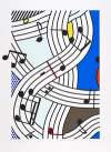
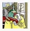
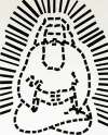
Roy Lichtenstein's Peace Through Chemistry repurposes the sleek industrial design of the 1930s—modernity's archetypal imagery—to counteract the traditionalism of art. The broad compositions are divided into three panels, then halved by diagonal lines, creating a compositional structure equally influenced by religious triptychs and comic book panels.
Roy Lichtenstein Peace Through Chemistry for sale
Sell Your Art
with Us
with Us
Join Our Network of Collectors. Buy, Sell and Track Demand
Meaning & Analysis
Commercial printing methods have been fundamental to Lichtenstein's celebrated Pop style, and the Peace through Chemistry series is no exception. The artist developed his signature visual language by merging the formalism of fine art with the vocabulary of material culture.
Lichtenstein’s Peace Through Chemistry, executed in the early 1970s, repurposes the inescapable imagery of commercial culture, thereby counteracting notions of classical art. This quietly ironic five part series is composed of four prints and one bronze plate. The artist exhibits masterfully orchestrated compositions, fuelled by his inclination for social commentary.
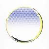
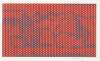
Peace Through Chemistry presents horizontal rectangles divided into three panels, in the style of a triptych, each imbued with its own conceptual value. The panels are also halved by a strong diagonal line running across them, resulting in the picture plane being split into six triangles in total. The partitions are more defined in the print editions, demarcated by Lichtenstein’s traditional black outlines.
The four lithographs in Peace Through Chemistry use a solid white support, strategically placed patterns and rich primary colours to varying degrees. The comic book shapes in these prints are inflated and their origins are instantly recognisable. Tone and texture are achieved through the differently sized Ben Day dots and the superimposed stripes on colour fields. Contrastively, the one surprising bronze piece of the sequence, owing to its material, allows the engraving to flow into one continuous coppery image.
Sources for the formal composition of Peace Through Chemistry can be traced back to Lichtenstein’s interest in the sleek industrial design of the 1930s. The stylised layout also functions as a cubist revision of the propaganda disseminated throughout America over this period. Commissioned by authorities during the Great Depression era, posters were ordered in reaction to the disastrous economic downturn. These illustrations were called the WPA Federal Art Project, and announced new cultural, educational and health programs issued by the government. The bright and creative placards meant to motivate and unite people, reminding them of shared collective values and the potential of a brighter future.