Standard Station (1966)
Ruscha's Standard Station captures the essence of Americana through the lens of Pop Art. Beginning with his seminal artist's book Twentysix Gasoline Stations in 1963, Ruscha transformed the mundane gasoline station into an iconic representation of the American landscape. His 1966 screenprint Standard Station, employs a dramatically foreshortened perspective, employing solid and blended colours through the innovative ‘split fountain’ technique. This piece, along with its variations, highlights Ruscha's experimental approach to printmaking and his exploration of the gasoline station motif, cementing it as a symbol of modern American vernacular.

OOF (1962)
Ruscha's OOF vividly encapsulates the essence of Pop Art through its integration of textual imagery and the sounds of contemporary culture. This artwork, conceived in 1962 and reworked in 1963, features a single, forceful word rendered in stark typography against a monochromatic background, standing as a testament to Ruscha's fascination with the phonetic elements of language—words that evoke sounds like 'slam', 'smash', or 'honk'. This painting diverges from the emotive spontaneity of the Abstract Expressionists, embracing a calculated, preconceived approach to art.
Ruscha's choice to portray OOF, a word that conveys a sound rather than a tangible object, plays on the silence of the painted medium, creating a humorous paradox that is further enriched by visual references to other contemporary artists such as Jasper Johns and Kenneth Noland. Through OOF, Ruscha explores the intersection of language, sound, and visual art, highlighting his pioneering role in blending textual content with visual form to reflect the vernacular of American culture.

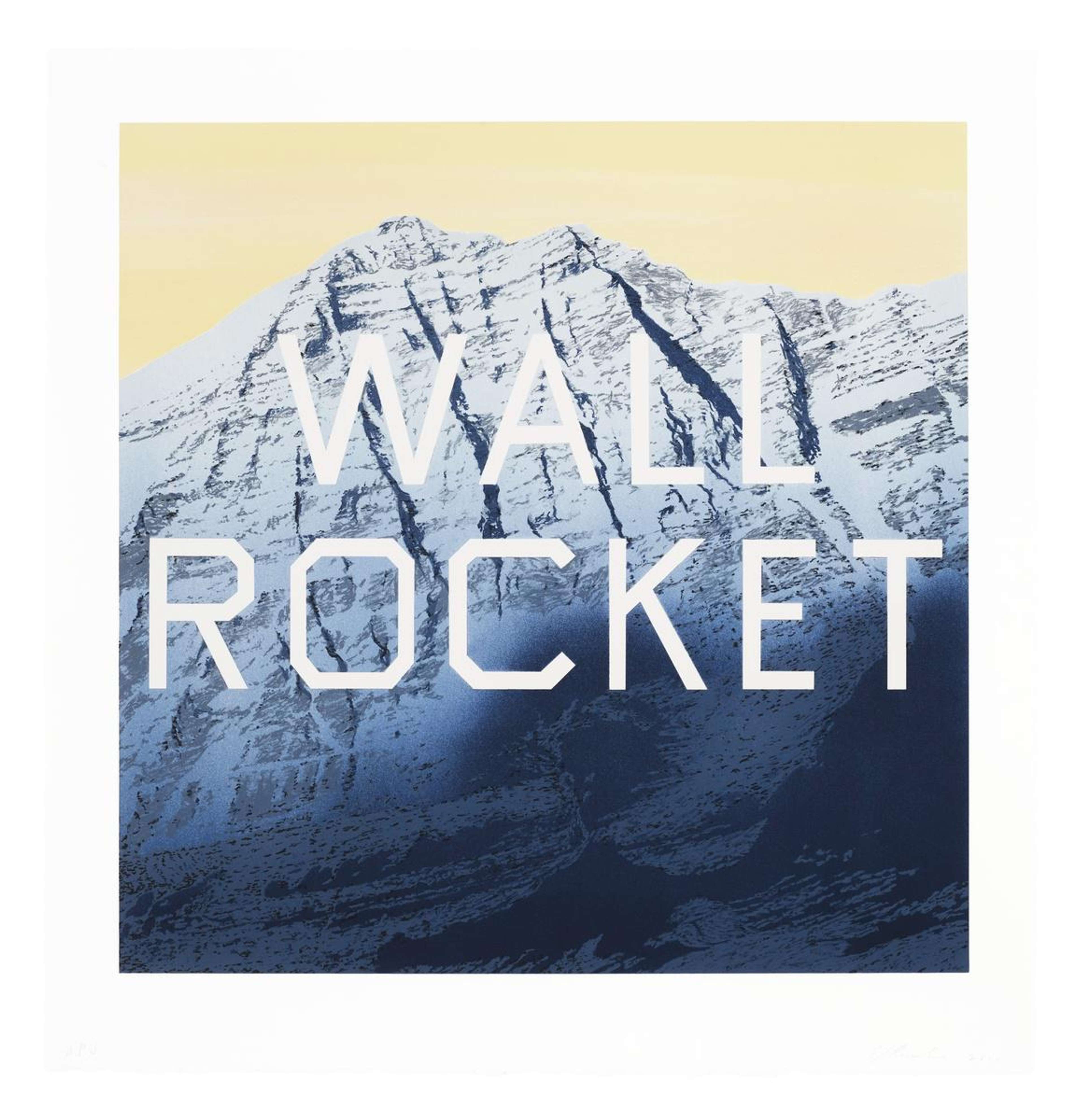
Pay Nothing Until April (2003)
Pay Nothing Until April showcases Ruscha's talent for blending natural landscapes with everyday commercial text, creating a visual paradox that critiques consumer culture's shallowness. This piece features a detailed depiction of mountains under a yellow sky, against which the phrase 'PAY NOTHING UNTIL APRIL' stands out in Ruscha's bespoke font, Boy Scout Utility Modern, which he humorously describes as having a 'no-style'.
This artwork reflects Ruscha's knack for juxtaposing the grandeur of natural landscapes with commercial and consumerist elements, encapsulating a critique of contemporary society's detachment and consumer culture. The meticulously detailed setting, reminiscent of an advertisement, contrasts with Ruscha's own stated indifference to his eclectic source material, revealing the artist's exploration of automatic, reflexive creation and the superficial sensibilities that shape our perceptions and experiences.

HONK (1962)
Ruscha's HONK captures the essence of his graphic design background and his exploration of Pop Art's visual language. In this 1962 acrylic painting, Ruscha employs diagonal, capitalised serif typography reminiscent of the Twentieth Century Fox studio logo. The lettering is filled in bright yellow against a dark blue background, accented with deep red to suggest depth.
This work reflects Ruscha's fascination with the power of monosyllabic words and their visual and auditory impact, blending sign painting with fine art through a bold, clear palette. Despite its commercial graphic elements, HONK remains a unique, handcrafted work, and not one of mass production.

Annie (1962)
Annie is a seminal work by Ruscha, showcasing his evolution towards his iconic use of text and popular culture references. In this nearly six-foot-tall painting, Ruscha blends the name 'Annie' from the comic strip Little Orphan Annie with a stark, contrasting colour scheme that splits the canvas into two distinct halves. The top features the word in bright red against a yellow backdrop, while the bottom immerses the viewer in a deep blue. This piece not only marks a pivotal moment in Ruscha's career, reflecting his fascination with the power of words and their visual representation but also situates his work within the broader context of Pop Art, differentiating his approach from contemporaries like Warhol and Lichtenstein by focusing on the formal aspects of typography rather than the character of Annie herself.

Actual Size (1962)
Actual Size by Ruscha, created in 1962, exemplifies the artist's early engagement with Pop Art themes, paralleling the works of contemporaries like Andy Warhol and Roy Lichtenstein by delving into mass production and consumer culture. This piece features an oversized brand name of Spam juxtaposed with an actual-size depiction of the can, symbolising the era's consumerism and the advertising mechanisms that amplify the allure of everyday products. Ruscha's work invites viewers to ponder the influence of commercial imagery in popular culture, employing humour and irony while exploring deeper questions of accuracy, scale, and the superficiality of American advertising.

Hollywood Tantrum (1979)
Showcasing Ruscha’s exploration of the relationship between text and art, this large-scale pastel drawing features the phrase ‘HOLLYWOOD TANTRUM’ in crisp, stencilled letters, standing boldly over a purple pastel field. Ruscha’s methodical approach in the lettering contrasts with the spontaneous pastel application. The title invokes images of the dramatic and volatile nature of Hollywood, reflecting the artist’s continued fascination with the city's culture. Through strategic use of stencils and a blend of precision and freedom in the background, Ruscha examines the intersection of language and imagery, playfully challenging viewers' perceptions of communication and the iconic lure of Hollywood.

Noise, Pencil, Broken Pencil, Cheap Western (1963)
In Noise, Pencil, Broken Pencil, Cheap Western, Ruscha presents a quartet of hyper-realistic images against a flat blue backdrop, utilising Trompe l’œil to challenge perceptions of space and sound. The canvas juxtaposes the textual depiction of the word of ‘noise’ with visual representations of everyday objects and pop culture, including a Western magazine cover and contrasting states of pencils, to explore themes of creation, disruption, and narrative within the visual arts. This work exemplifies Ruscha's exploration of language and American iconography, marking it as a pivotal piece in his oeuvre.

Hurting The Word Radio #2 (1964)
Ruscha's Hurting the Word Radio #2 embodies the Pop Art movement's embrace of commercial aesthetics, with its striking yellow 'RADIO' set against a clear blue. The painting, fetching over $52million at auction in 2019, highlights Ruscha's fascination with the pervasive nature of advertising in America's booming consumer culture. Ruscha uses mechanical typography to evoke a sense of the everyday. This work also features c-clamps altering the letters 'R' and 'O', a playful yet subversive commentary on communication distortion, reminiscent of the experience of tuning a radio in a moving car. Ruscha's approach parallels Warhol's use of brand imagery, both artists choosing icons of American life to bridge contemporary experience with art.

OK (State I) (1990)
In OK (State I), Ruscha's 1990 lithograph centres on the word 'OK' combining peachy-orange letters against a blue and purple background. This work illustrates Ruscha's fascination with the interplay between text and colour, creating an abstract, non-perspectival space where words float without a definitive scale, hinting at both the casual affirmation 'okay' and Ruscha's connection to Oklahoma. His background in graphic design is evident in the piece's clear, impactful use of typography, a hallmark of his exploration into the visual and conceptual potential of words in art.