Armageddon Is It Too Much To Ask (small)
Armageddon Is It Too Much To Ask (small)
Signed Print
Harland Miller
£3,500-£5,500
$6,500-$10,500 Value Indicator
$6,500-$10,000 Value Indicator
¥30,000-¥50,000 Value Indicator
€4,050-€6,500 Value Indicator
$35,000-$60,000 Value Indicator
¥740,000-¥1,170,000 Value Indicator
$4,750-$7,500 Value Indicator
There aren't enough data points on this work for a comprehensive result. Please speak to a specialist by making an enquiry.
102 x 67cm, Edition of 50, Etching
Auction Results

Track auction value trend
Meaning & Analysis
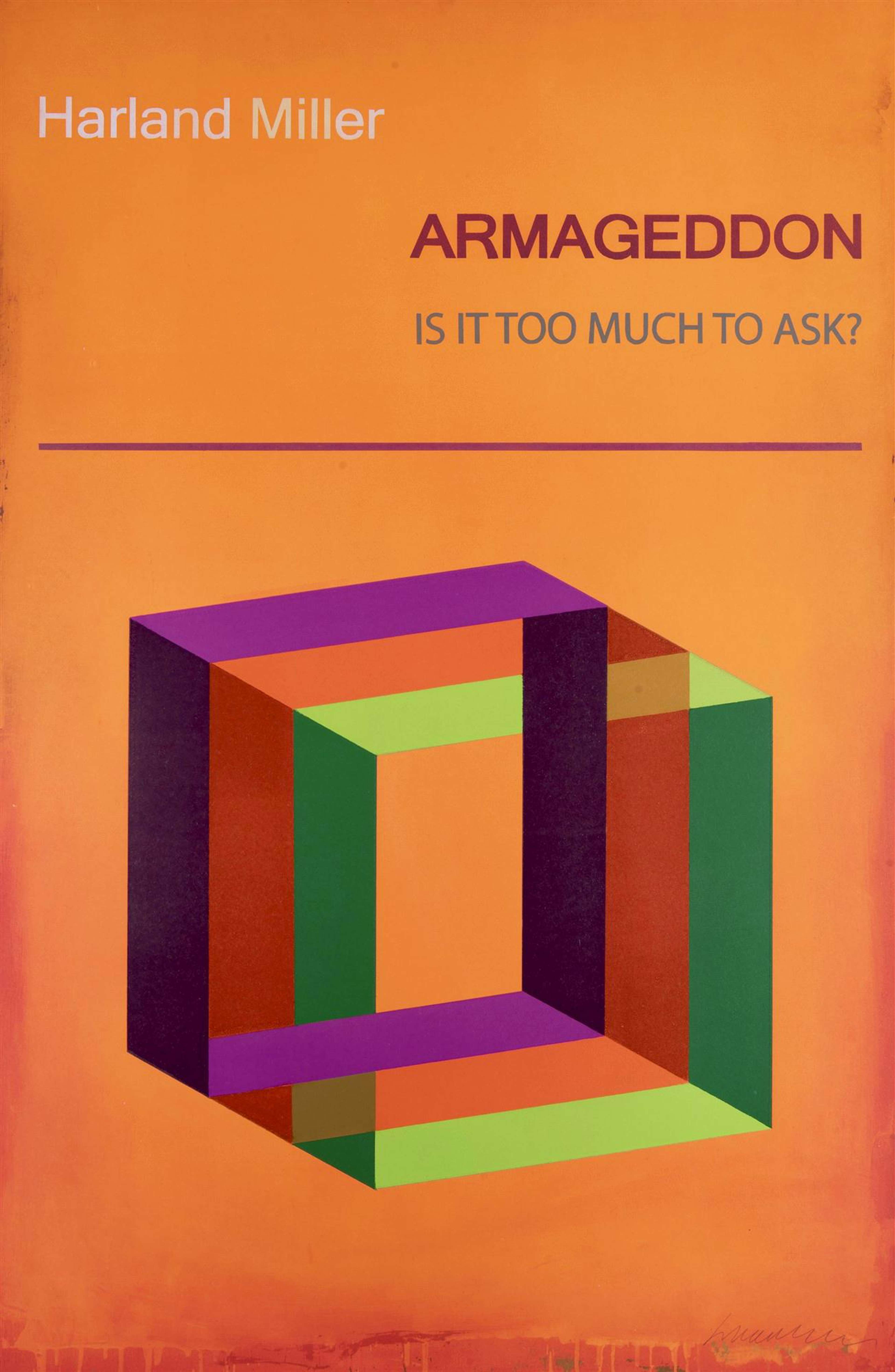
Harland Miller’s 2017 print, Armageddon Is It Too Much To Ask?, takes inspiration from popular psychology books, self-help manuals and social science publications from the 1960s and 1970s. Characterised by their bold and abstract covers, these books aspired to aid disorders. Their distinct, colourful geometric designs sought to counteract the heavy medical content, while also mirroring the style of contemporary paintings.
The artist utilises various printmaking techniques in Armageddon Is It Too Much To Ask?. By employing polymer-gravure, photo-etching and block printing, Miller achieves a more graphic and superimposed finish. While at first glance the work might seem one dimensional, its main elements have in fact been given a multilayered appearance.
The disposition of the textual and the figurative components in this print have been revised, and the title no longer occupies the central panel. As opposed to the artist’s earlier adaptations of Penguin book covers, the observer is unlikely to be intimately familiarised with the source material utilised in this work. As a result, a different kind of relationship is formed between form, text and colour palette. In effect, the title is actually activated by the bold colour composition in the centre. A corresponding strategy and structure can be detected in Miller’s Happiness: The Case Against.
