H3
Colour Charts
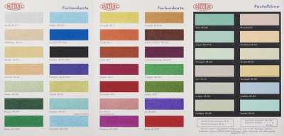
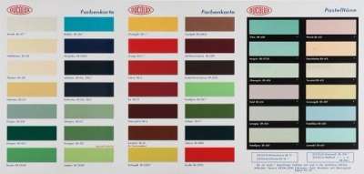
In Damien Hirst’s 2017 H3 Colour Chart series, each print resembles a paint chart from a homeware shop, with rectangular colour swatches labelled and numbered. Expanding on the colour composition of his Spot paintings, Hirst uses simple structure to express ‘the joy of colour,’ provocatively placing the banal into an artistic light.
Damien Hirst H3 Colour Charts For sale
H3 Colour Charts Value (5 Years)
Damien Hirst's Colour Charts series has historically shown more modest results compared with the artist’s wider oeuvre, with auction prices ranging from £3 to £6500. Average annual growth has remained modest at -14.0%, with certain works seeing declines in value. Over 20 total auction appearances, average selling prices have held steady around £3472. This series appeals to collectors seeking accessible entry points into Damien Hirst’s print market.
H3 Colour Charts Market value
Auction Results
| Artwork | Auction Date | Auction House | Return to Seller | Hammer Price | Buyer Paid |
|---|---|---|---|---|---|
 H2 Colour Chart Damien Hirst Signed Print | 24 Jan 2026 | Phillips London | £1,488 | £1,750 | £2,450 |
 H3 Colour Chart (Glitter) Damien Hirst Signed Print | 19 Mar 2025 | Tate Ward Auctions | £3,188 | £3,750 | £5,000 |
Sell Your Art
with Us
with Us
Join Our Network of Collectors. Buy, Sell and Track Demand
Meaning & Analysis
Immediately recognisable as the work of Damien Hirst, The Colour Charts series was produced in 2017, each print published in an edition of 250. The works in the series show images of several coloured boxes in a grid-like composition, resembling commercial paint charts from a homeware shop, each colour labelled and numbered. This series was developed from Hirst’s famed Spot Paintings, allowing him to continue to explore ‘pinning down the joy of colour.’
Hirst has explained of this series: 'The Colour Charts mean you get to kill two birds with one stone, or I do: I get to please myself with that joy of colour but then also it’s a found object, something I’ve found in the real world and reproduced. They’re about the nature of art: something very comforting in the real world can become terrifying in works of art. What’s comforting in a work of art is a faithful representation of the real thing, so once you take an object from the real world and make it into a great big painting it becomes a terrifying thing…people just go ‘why?’ and the question ‘why?’ horrifies people [they just go] why would you do that?'
Hirst’s most important influences such as Pop art and Dada come through in this series that place his oeuvre within a much longer art historical context than one might expect. Taking the idea of the ‘readymade’ from the famous Dada artist, Marcel Duchamp, the colour charts used in this series are found objects. Furthermore, taking a mass-produced object and repurposing the image is a key part of the work of Pop artists like Andy Warhol and Richard Hamilton from decades before Hirst’s career. The colour charts are reproduced in a print edition, transforming them from functional tools to aestheticised objects. The juxtaposition of colour in a systematic grid formulation across each composition works to highlight the interactive and endless potential of colour itself.
With much of his work, Hirst sets out to shock the viewer. The Colour Chart series manages to provoke the viewer since it is an object found in everyday life that is cast in a new light by the artist. This is what Hirst claims is the nature of art itself. Forcing the found object of the colour chart into the realm of ‘high art,’ Hirst aestheticises an often-discarded object and creates a work that simultaneously fascinates, inspires and outrages its audience.