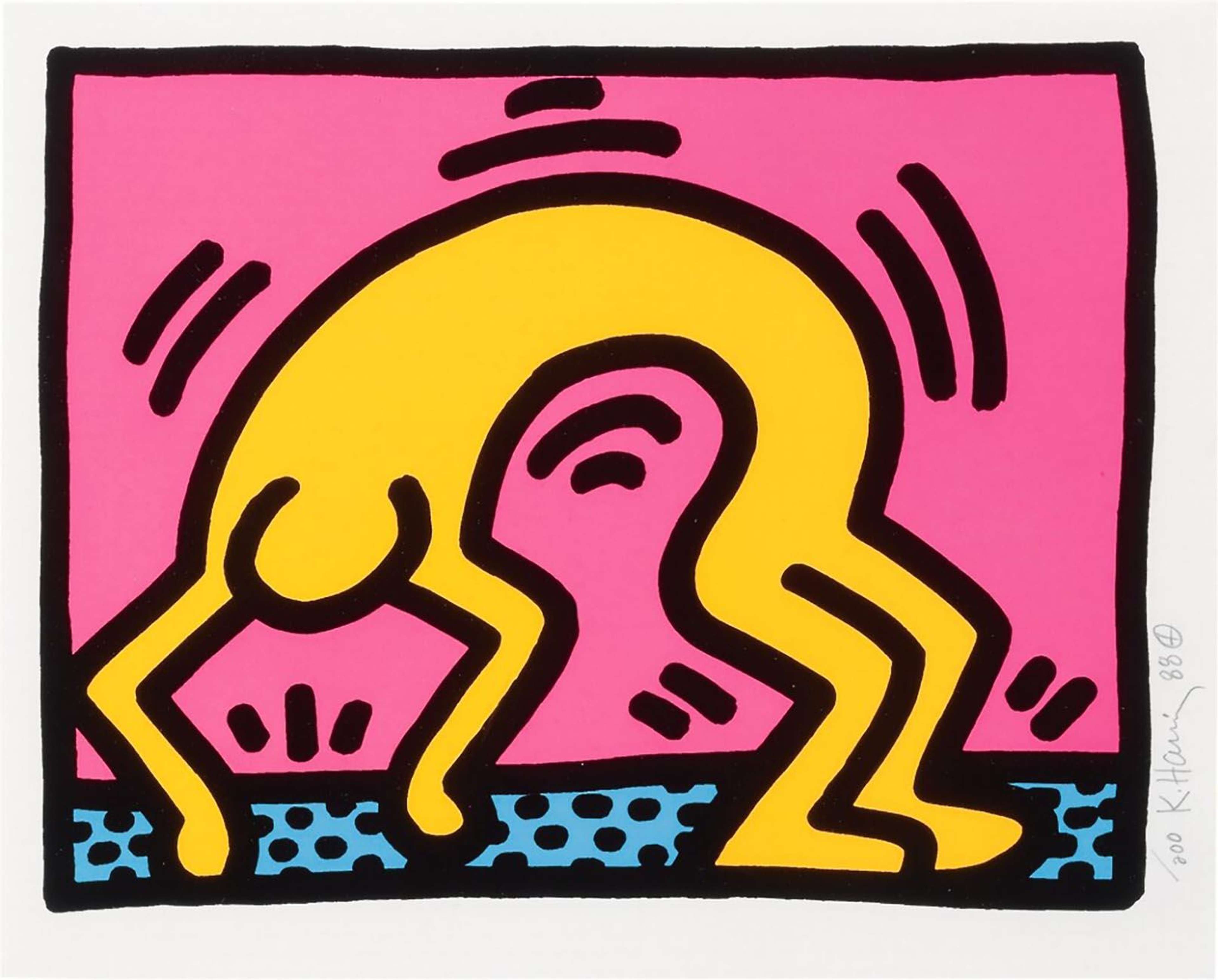
Featuring some of his most recognisable motifs, Keith Haring’s Icons is a set of five prints, each a single symbol rendered in his vivid and linear style. Depicted in flattened, saturated colours and contoured in thick, bold lines, the series presents five Haring icons; the radiant baby, angel, flying devil, three-eyed monster and barking dog.
The Icons symbols first appeared in New York subway stations.

From early on in his career, Haring created his own recognisable symbols to use in his New York subway drawings. Haring created drawings on the subways as a quick and effective way to bring art into the public. He would hop on and off the trains and use chalk to draw his iconic figures onto blank advertising boards on the platform.
The radiant baby was Haring’s first ‘tag’.

Used very early on in his career, the radiant baby symbol in this series was originally used by Haring in place of his signature on public art projects on the street. As a result, the radiant baby has become one of Haring’s most iconic and highly recognisable symbols.
The Icons series reworks traditional Christian iconography.

Rooted in his encounter with the Jesus Movement of the 1970s, prints like Radiant Baby, Angel and Flying Devil, are demonstrative of the way the artist shapes traditional religious symbols to reflect the contemporary concerns of his generation. Haring reworks this Christian iconography to critique organised religion and the government amidst the HIV/AIDS epidemic of 1980s New York.
Haring’s positive visual language is actually highly critical.

The brightly coloured symbols in this series at first appear like children’s drawings, but Haring was actually using this positive visual language to be critical of the government, capitalism and mass consumerism. His use of highly saturated bright colours are uses to mimic advertisements of the time, while each symbol holds a deeper meaning.
Each symbol in this series has an underlying meaning.

The Radiant Baby was used by Haring as a symbol of hope for the future and the Angel symbolises life and death, both pertinent during a time that was characterised by the horrors of the AIDS epidemic. The Barking Dog symbols is understood to be an imaginary representation of authoritarian government and people who hold power. The Flying Devil represents the profane, while the Three Eyed Monster represents greed amidst the proliferation of capitalism in 1980s New York.
Haring was inspired by Andy Warhol.
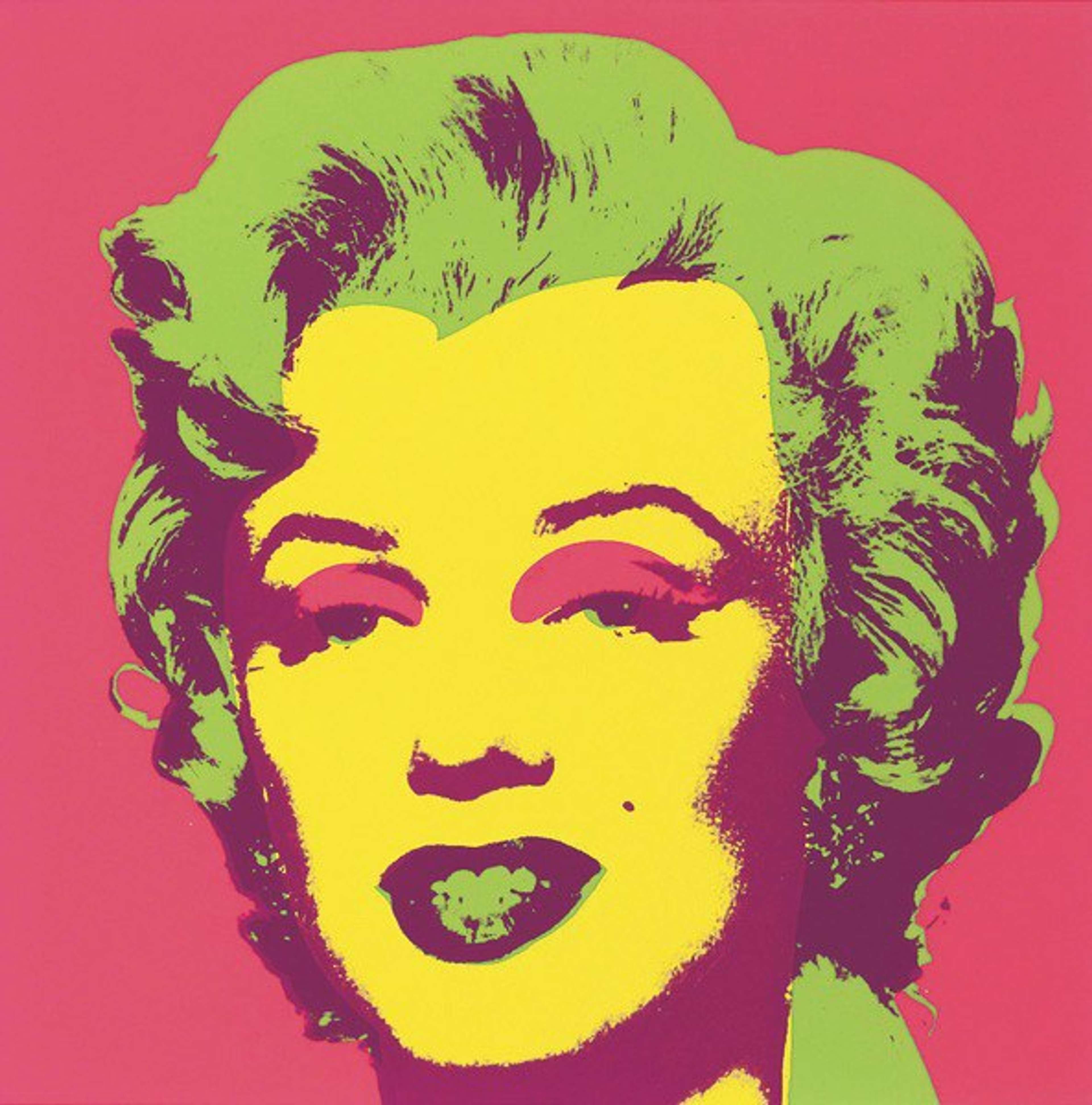
Undoubtedly inspired by the Pop Art movement and Andy Warhol, Haring uses his brightly coloured artworks icons to oppose the negative effects of capitalism and mass consumerism. Using the screen printing method adopted from the commercial printing work, like Warhol, Haring was able to produce multiple versions of the same image with vivid colours.
This series evidences Haring’s commitment to public art.

By producing a set of symbols in bright colours and with clearly discernable meanings, Haring created a universal language through which he could communicate critical messages to a public audience. The simplistic quality of the Icons also meant that Haring could quickly produce these symbols in public spaces.
The icons series is an example of Haring’s desire to mimic advertisements
The Icons series prints are rendered in flat, saturated colours as a nod to the rise of commercialism and mass production in Haring’s lifetime. As evidenced by his famous Pop Shop, Haring conflated high art with commercialism and so claimed to mirror the capitalist world that he lived in.
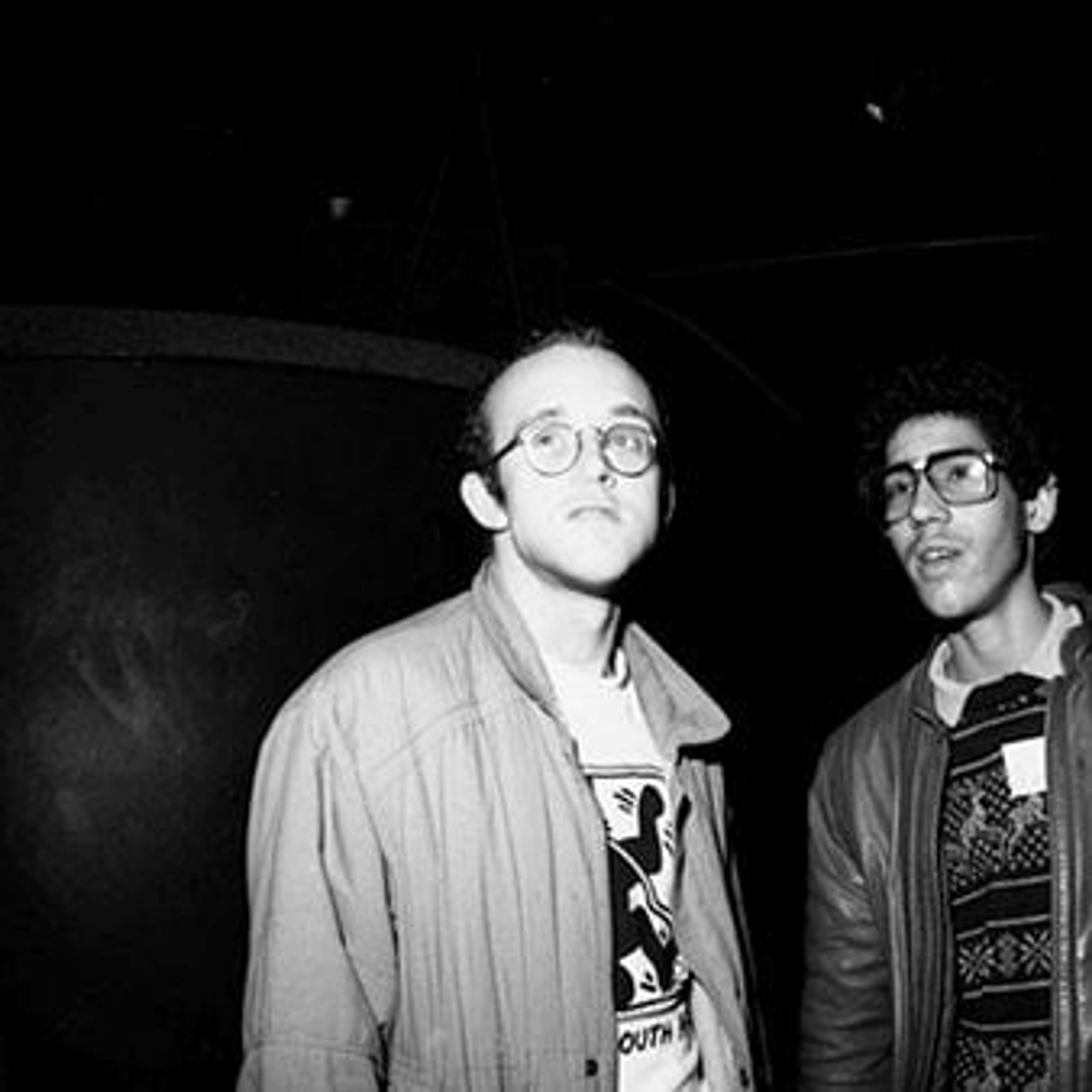
Jean-Michel Basquiat also reused symbols and motifs like Haring.

Basquiat and Haring were contemporaries on the New York street art scene and though in style their work was very different, some of their techniques were similar. Both artists used motifs and symbols many times over, across many different works, creating memorable pictorial languages and tags.
This series is inspired by Egyptian hieroglyphics.

Adopting a system of expression inspired by Egyptian hieroglyphics, Haring’s syntax of signs create a universal language and a true public art charged with moral weight.