A is for Album Cover
Ruscha, renowned for his integration of text and imagery, crafted the cover art for The Beatles' 2023 single, Now and Then, showcasing his quintessential style. This collaboration marries Ruscha's artistic vision with the legendary band's musical legacy, offering a visual complement to the band’s auditory farewell. The project highlights Ruscha's influence across art forms and his ability to bridge Contemporary Art with pop culture.
B is for Book
In 1963, Ruscha introduced Twentysix Gasoline Stations, a seminal artist book inspired by his road trips from Los Angeles to Oklahoma City. The book captures the distinctive, streamlined architecture of the gas stations along his route, reflecting Ruscha's fascination with the mundane yet iconic elements of the American landscape. This was followed by Some Los Angeles Apartments in 1965, showcasing the city's geometric architectural styles through a series of photographs.
C is for Chouinard Art Institute
Ruscha's formative years at the Chouinard Art Institute, now known as the California Institute of the Arts, spanned from 1956-60, a period during which he also gained hands-on experience in commercial art. His time at Plantin Press in 1958, where he learned the intricacies of press operation and typesetting, bridged his artistic development with practical skills in the art world.

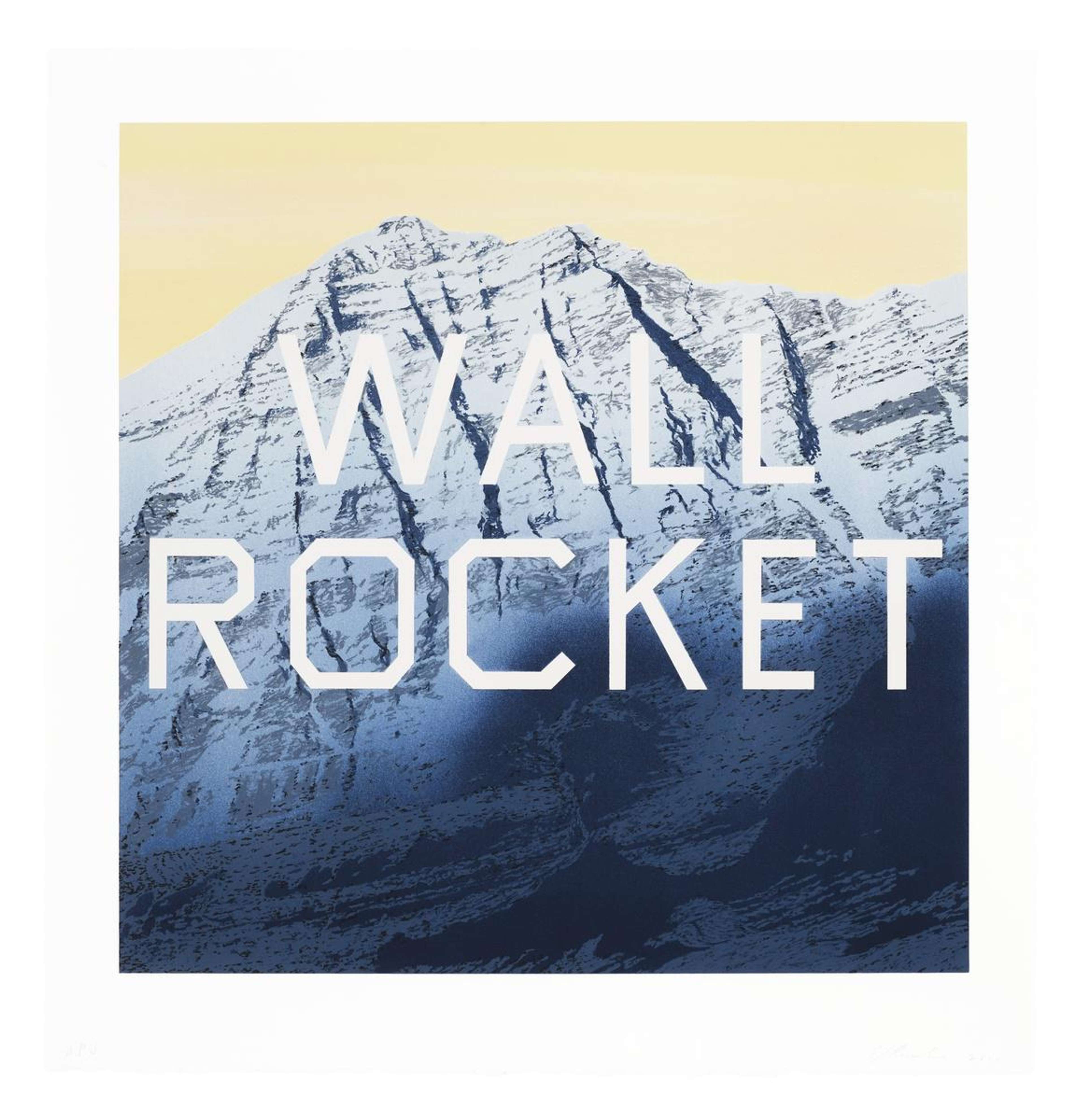
D is for Daily Planet
Daily Planet is a 2003 painting by Ruscha which showcases his signature juxtaposition of text with natural imagery, here featuring a detailed snow-capped mountain beneath the phrase 'DAILY PLANET' in a modern font. This painting is part of a series that began in the 1980s, where Ruscha explored the interaction between landscapes and overlaid texts, complicating the relationship between language and the visual. The contrast in Daily Planet specifically plays with the visibility of white text against the snowy backdrop, obscuring the relationship between the two.
E is for Every Building On The Sunset Strip
In 1966, Ruscha produced a concertina-format book, titled Every Building On The Sunset Strip, revealing the artist’s innovative approach to capturing Los Angeles's essence. By mounting a motorised camera on his pickup truck, Ruscha created a continuous photographic survey of Sunset Boulevard, likening the storefronts to facades of a Western town, highlighting their superficial frontage. This project sparked Ruscha's enduring interest in documenting LA streets, a pursuit that extended over fifty years.
F is for Film
Ruscha's engagement with film, notably through his direction of two short films, Miracle (1975) and Premium (1971), extends his critique of consumerism, a theme pivotal to his Pop-Art significance. These short films, rich in colour and narrative, delve into the everyday, transforming mundane consumer experiences into subjects of artistic exploration, thus underscoring Ruscha's ability to depict the commercialised American landscape through a variety of mediums.

G is for Gasoline Station
The gasoline station emerges as a recurrent motif in Ruscha's art, capturing the essence of American prefab architecture's replicability. His iconic 1966 painting, Standard Station, a reshaped image with a dynamic perspective, epitomises Ruscha's impact on American visual culture, marking it as a quintessential piece. This specific station, on the outskirts of Amarillo, Texas, has been reinterpreted by Ruscha in various works, including the 1969 screen print Double Standard.
H is for Hollywood
Ruscha's exploration of the Hollywood sign exemplifies his knack for blending words with landscapes, creating layers of meaning within a seemingly incongruous setting. His artwork delves into the glamour the infamous sign represents, juxtaposing it against the reality of the industry it symbolises. Through his manipulation of typeface, colour, and scale, Ruscha's work critiques Hollywood as a commercialised product, offering a nuanced view of Southern California's cultural landscape as both alluring and misleading.
I is for Insects
In 1972, Ruscha produced the Insects collection, featuring six colour screenprints of flies, ants, and cockroaches. These life-sized prints, complete with shadows, create the illusion of three-dimensional creatures occupying the flat space of the artwork. This work not only highlights Ruscha's artistic versatility but also his enduring interest in the physical world around him.

J is for Japser Johns
Johns was an early influence on Ruscha. During his studies at the Chouinard Art Institute, Ruscha saw Johns' Target With Four Faces (1955) in a magazine and was drawn to Johns' innovative use of everyday objects. This encounter sparked a shift in Ruscha's focus from graphic arts to painting, blending Pop Art sensibilities with his unique approach to text and imagery.
K is for Kids
Ruscha frequently incorporates the term ‘kids’ into his artworks, reflecting on American culture and the technological revolution. Ruscha’s 1987 painting Whiz Kids encapsulates the burgeoning era of technological innovation, symbolising the rise of the tech industry and its pioneers. Ruscha's use of the word ‘Kids’ captures a pivotal moment in history, marking the digital age's impact through his characteristic blend of text and imagery.
L is for Los Angeles County Museum of Art on Fire
Ruscha's painting Los Angeles County Museum of Art On Fire (1965-68) embodies his nuanced critique on the barriers which existed between Contemporary Art and the museum world in the ‘60s. The painting's conception, involving aerial photography, adds a dramatic perspective to this iconic Los Angeles landmark, capturing Ruscha's reservations about the museum's role in the cultural landscape.

M is for Mason Williams
In collaboration with Williams, Ruscha produced the 1969 screenprint Double Standard. This partnership between Ruscha and Williams is noteworthy for blending artistic vision with a critique on the inequalities intrinsic to American consumerist culture, as suggested by the work's title. Their collaboration underscores Ruscha's ongoing engagement with language and urban landscapes, offering a unique perspective on everyday American culture.
N is for Nine Swimming Pools and a Broken Glass
Nine Swimming Pools And A Broken Glass is a book by Ruscha, published in 1968, which showcases photographs of swimming pools from low-budget Las Vegas motels and a singular image of a broken glass. This work marks a shift in Ruscha's exploration of the Los Angeles landscape, featuring colour photography and creating an ambiguous narrative thread through its sequencing. The juxtaposition of leisurely pools with the danger of broken glass evokes a sense of disrupted tranquillity, highlighting Ruscha's ability to weave an unsettling complexity into his visual documentation.
O is for Omaha
Ruscha was born in Omaha, Nebraska. Growing up in America's Midwest nurtured Ruscha's early artistic curiosity, as he was drawn to the bold graphics of stamps and coins. This interest laid the groundwork for his future as a leading figure in the art world.

P is for Parking Lots
Ruscha's Parking Lots, a portfolio of seminal photographs from 1967, encapsulates his fascination with the everyday urban landscape through aerial photographs of empty parking lots in Southern California. These images, showcasing locations like Dodgers Stadium and Universal Studios, explore themes of seriality, urban sprawl, and car culture with Ruscha's signature deadpan approach.
Q is for Q-Tip
In Cotton Puffs, Q-Tips®, Smoke And Mirrors: The Drawings Of Ed Ruscha, the artist's use of unconventional tools like cotton puffs and Q-tips® to create his artworks is highlighted. These tools, alongside techniques that produce illusory effects, underscore Ruscha's innovative approach to art. This book, aligning with exhibitions from 2004-2005, showcases Ruscha's mastery in manipulating materials to craft detailed and nuanced pieces.
R is for Ripe
In November 2021, Ruscha's 1967 oil painting titled Ripe, a hallmark of his bold textual art, was auctioned for a remarkable $20million at Christie's New York. The painting, featuring the word 'ripe' in a three-dimensional style, hints at Ruscha's exploration of everyday objects and foreshadows his experimental use of materials like maple syrup and chocolate. As a pioneering figure in the US Pop Art movement, this work illustrates Ruscha's seminal approach to art and media.
S is for Stains
Ruscha's Stains (1969) is a revolutionary boxed set of stained sheets of paper, embodying his innovative exploration of consumerism through the lens of everyday brands and the unintentional marks they leave. By using a variety of substances, from beer to coffee, and noting their commercial origins, Ruscha reflects on the pervasive nature of branding in our daily lives. This work represents a shift from traditional painting to a more interactive engagement with the materiality of the medium and the consumer goods that define contemporary culture.

T is for Typography
Typography prominently features in Ruscha's artistry, through which he explores the creative capacity of text intertwined with visuals. His text pieces, rich in irony and humour, employ linguistic tools like onomatopoeia and puns, crafting spatial and emotional narratives on the canvas. HONK, Ruscha’s 1962 painting exhibits visible brush marks in red and blue, and a textured effect where the paper's surface peeks through the blue. These nuances serve as a reminder that, despite the artwork's graphic, advertisement-like style, it is a distinct, handcrafted piece, not a product of mass production.
U is for Unconventional Materials
Ruscha's exploration into unconventional materials for his artwork is epitomised by Chocolate Room, first created in 1970 in Venice, Italy. During this time, Ruscha was experimenting with various substances in printmaking, leading him to use chocolate as a medium. By screenprinting chocolate onto paper and adorning the walls of a room with these prints, Ruscha merged culinary and artistic realms, offering a multi-sensory experience.
V is for Vinyl
Ruscha's 2Pac - All Eyez On Me Giclée print from 2022 is a notable intersection of visual art and music, mounted on a custom-dyed linen-wrapped vinyl jacket. This limited edition piece, part of the ‘Artists Inspired by Music: Interscope Reimagined’ project, showcases Ruscha's foray into combining traditional artistic mediums with contemporary cultural symbols. The project's proceeds supported the Iovine and Young Foundation, blending philanthropy with artistic innovation.

W is for Wen Out for Cigrets N Never Came Back
The cast bronze sculpture, Wen Out for Cigrets N Never Came Back (2017) by Ruscha embodies his knack for weaving American vernacular into art, spotlighting phrases that reflect societal narratives. The phrase captures the cliché of leaving under a trivial pretext, encapsulating a complex emotional spectrum within a seemingly simple act. Ruscha's work, removing specific letters, transforms this common phrase into a poignant reflection of American culture, blending humour with deeper commentary on absence and the nuclear family.
X is for XXX (Dedicated To A Jug Of Whiskey)
XXX (Dedicated To A Jug Of Whiskey) is a 2021 work by Ed Ruscha that belongs to his Dedication Stone series, highlighting the versatility of the letter 'x'. This series, showcased at Gagosian's Saanen location, features typographic studies that delve into the abstract and cultural dimensions of words incorporating 'x'. Ruscha's use of unconventional materials and his humour shine through in this series, demonstrating his continual exploration of language's form and meaning.
Y is for Youth
Ruscha's early experiences holidaying in California, influenced by Walker Evans' photography and the film The Grapes of Wrath, shaped his view of the state as a modern 'new frontier'. The vibrant culture, distinct from his Oklahoma upbringing, sparked a lifelong fascination with its allure and fast-paced lifestyle. This profound impact ignited Ruscha's artistic journey, deeply embedding his relationship with California into his work.
Z is for Zone
In 1961, Ruscha produced Zone, layering torn and pasted paper and ink onto paper. This piece marks an early foray into Ruscha's signature blend of textual and visual elements, setting the stage for his later works that often feature a juxtaposition of imagery and language. Zone reflects Ruscha's interest in the boundaries and transitions within physical and metaphorical spaces.