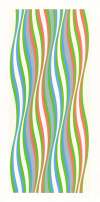
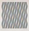
Waves
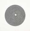
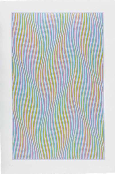
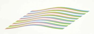
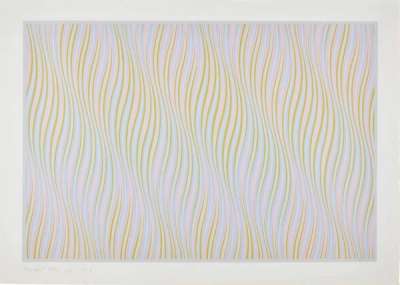
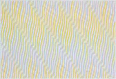
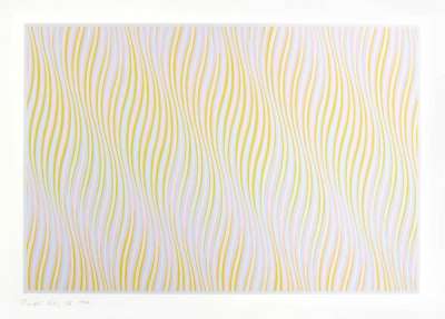
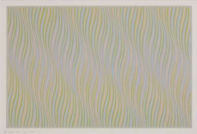
Bridget Riley's Waves ripple across the picture plane, defying their two-dimensionality. Composed of mixed hues - rather than true colours - Riley's palette intensifies the optical sense of movement in these prints. Through a mastery of tonality and form, Riley's prints seem to swell and pulsate like real waves of water.
Bridget Riley Waves For sale
Waves Value (5 Years)
With £42765 in the past 12 months, Bridget Riley's Waves series is one of the most actively traded in the market. Prices have varied significantly – from £147 to £17550 – driven by fluctuations in factors like condition, provenance, and market timing. Over the past 12 months, the average selling price was £6109, with an average annual growth rate of 15.84% across the series.
Waves Market value
Auction Results
| Artwork | Auction Date | Auction House | Return to Seller | Hammer Price | Buyer Paid |
|---|---|---|---|---|---|
 Elapse Bridget Riley Signed Print | 19 Nov 2025 | Christie's New York | £7,225 | £8,500 | £11,500 |
Untitled Wave Bridget Riley Signed Print | 29 Oct 2025 | Forum Auctions London | £3,060 | £3,600 | £4,550 |
 Untitled (Rose) Bridget Riley Signed Print | 26 Oct 2025 | SBI Art Auction | £5,950 | £7,000 | £8,000 |
 Untitled (bronze) Bridget Riley Signed Print | 26 May 2025 | Mallet Japan | £9,350 | £11,000 | £13,000 |
 Untitled (blue) Bridget Riley Signed Print | 11 Apr 2024 | Brunk Auctions | £5,950 | £7,000 | £9,000 |
 Rose Bridget Riley Signed Print | 4 Mar 2006 | Clars Auction Gallery | £1,955 | £2,300 | £2,850 |
Sell Your Art
with Us
with Us
Join Our Network of Collectors. Buy, Sell and Track Demand
Meaning & Analysis
Riley’s Waves create undulating fields of colour and movement, the lines appearing to ripple despite the static nature of the print. Fizzing with optical effervescence, the lines appear to ripple. The line of each wave employs several colours at regular intervals, the chosen colour lasting for one-and-a-half wave lengths, with each colour starting and ending at every peak or trough. The individual components of the canvases are not registered by the viewer. Instead, the work is viewed as a whole ‘field’ in which the resulting visual effect is created by an awareness of all the varying parts of the painting at the same time.
Riley consciously selected mixed hues, rather than pure colours, in the Waves collection, in order to maximise the interaction between the lines and tones in the eye of the viewer. Riley credits her fervent interest in colour to the Italian Futurists and French masters, such as Henri Matisse and Georges Seurat. Pointillism and Divisionism also underpin Riley’s practice, both Modern art movements relying on the capacity of the eye to blend colours placed side by side, obtaining a fuller range of tones.
Whilst viewing works in the Waves collection, such as Untitled (Blue) (1978) and Elapse (1982) up close, the different shades are perfectly separate and recognisable. Yet, from a distance, they overlap and fuse together. This impression, combined with the evocation of movement within the lines, create optical effects, from which the label Op Art takes its name.
During a trip to Egypt in 1979, Riley discovered the art of tomb painters who masterfully captured the splendour of daylight in subterranean darkness. Consequently, Riley was moved to shift her own towards brilliant, dazzling hues. Riley additionally changed from using acrylic paint to oil, favouring the higher saturation of the latter medium. Collectively, Riley’s works became harmonies of colour, a stark contrast to visually disruptive black and white paintings which contributed to Riley’s rise to prominence in the 1960s. Refusing to stick to the reductive label of Op Art, Riley continues to push the boundaries of abstract painting. Riley has established herself as a major modern painter, in a tradition that extends back to Seurat’s pointillism and Matisse’s colourful cutouts.