David Hockney's Moving Focus series is a captivating blend of tradition and innovation. Born out of a transformative California experience and collaboration with master printer Kenneth Tyler, the series defies artistic norms. From the symbolism of chairs in his compositions to his expansive range of prints, Hockney challenges viewers to see art from his uniquely intimate point of view. Subtle nods to Picasso's influence and a vibrant colour palette bring Hockney's emotions to the forefront. Known for its global acclaim and intricate perspective techniques, Moving Focus is a groundbreaking collection that invites viewers to redefine their understanding of modern art.
It’s origin story begins in California.

David Hockney embarked on a transformative chapter of his artistic journey upon relocating to the vibrantly scenic landscapes of California. It was here that he crossed paths with the esteemed master printer, Kenneth Tyler, who had previously collaborated with art luminaries like Jasper Johns, Frank Stella, and Roy Lichtenstein. Their unique partnership melded Tyler's unmatched technical prowess with Hockney's insatiable exploration of art. The pinnacle of their collaboration emerged as Moving Forward. This masterpiece not only resonates with the bright Californian palette but also reflects the spirit and hues of Hockney's Yorkshire roots, showcasing a blend of form and vibrant colours, intensified by Tyler's adept touch.
This is Hockney’s largest print series

As his most expansive print collection, it demonstrates not just quantity but an unmatched depth of experimentation. Its diversity, spanning 26 prints, reflects Hockney's relentless quest to push the boundaries of printmaking, making the series an indispensable reference point in contemporary art. Beyond the techniques, the series also offers insight into Hockney’s adaptability. While many artists find their niche and remain there, Hockney's Moving Focus reveals an artist in constant dialogue with his medium, unafraid to shift, evolve, and redefine his artistic language.
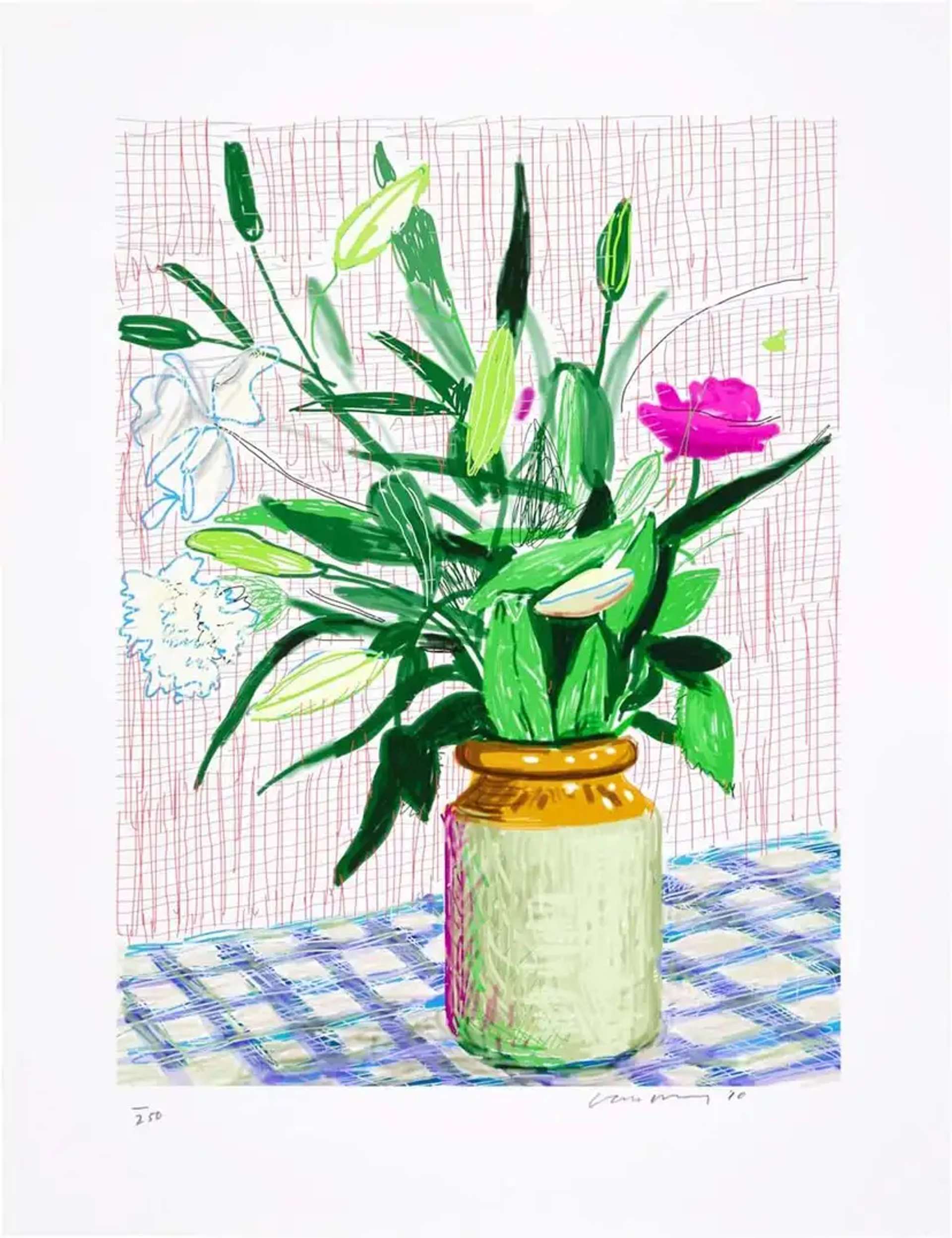
It's a blend of fine art and childlike sensibilities

Rather than steeping his works in nostalgia or academic rigour, Hockney's choice of medium imparts a refreshing accessibility to the series. It's as if he's dismantling the barriers of high art, beckoning viewers to step into a more candid world. Through this series, Hockney challenges traditional notions and invites viewers to experience modern art from a more intimate vantage point: his own.
The Moving Focus works have been featured in a retrospective
In 2002, The Kunstmuseum Luzern held Switzerland’s first Hockney retrospective, including many works from Moving Forward. Other esteemed art institutions across the world, including the Museum of Modern Art, the Tate Collection, and the National Gallery of Australia, proudly feature works from the series.
Hockney features a variety of subjects in this series

A recurring motif in Hockney’s oeuvre is the intimate portrayal of those closest to him. His mother, a figure of immense personal significance, frequently graces his works, capturing a deep familial bond. Similarly, close friends and intimate relationships, presented with a depth of emotion, offer a window into Hockney's personal world, revealing his attachments, memories, and experiences.
However, the series also showcases meticulously crafted stills of interiors, each telling a story of spaces that have left an impression on the artist. These aren't just rooms, but sanctuaries of memories, covered in small details. Equally dominant in this series is Hockney's romance with landscapes. They don't play second fiddle to his human subjects but stand shoulder to shoulder, highlighting his reverence for the natural world.
Chairs became a leading motif for Hockney

Chairs, as mundane as they might seem, hold a significance in the series. These everyday objects anchor many of Hockney's compositions, carrying their own weight. In works like Tyler Dining Room, we see the chairs work as supporting subjects to a larger narrative in this work. However in Two Pembroke Studio Chairs they command attention, each with their individual style and contrast against their background, suggesting its own dialogue around space, presence, and occupancy.
Hockney didn’t shy away from a vibrant colour palette

Rather than simply imitating life, Hockney utilised brilliant hues to offer a deeply personal interpretation of it. With the canvas awash in shades of glowing blues, fiery reds, and vibrant greens, he created far beyond representation. It’s evident that his intent was not just to depict reality but to imbue it with emotion, enabling viewers to perceive the world through Hockney's own passionate and lively lens. His colour choices, while perhaps seeming exaggerated to some, serve as an insight into the artist's psyche—where emotions intertwine with visual cues.
You might recognise a Picasso undertone

This series may just as well be an homage to Cubist principles and Picasso’s influence. While we see Hockney’s signature use of fragmentation in his colourful compositions; his perspective seen in the slants and striped designs and patterns; it’s the vibrant images of Celia where we see the biggest undertones of Picasso’s technique employed in Moving Focus. These works have the body reconfigured in a way that resembles the Old Master painter’s penchant for abstraction; but still has its own unique quality about it, largely credited to Hockney’s application of colour and choice of medium.
In Red Celia these techniques are subtly presented, almost hiding in plain sight. Upon first glance, viewers may only notice one profile of the subject–her side profile. However, after closer inspection, there is also a frontal view point that’s somewhat washed away in the intense shade of red. This dual perspective not only adds depth to the portrait but also showcases Hockney's mastery in layering technique.
Hockney embraces both modernity and tradition

Throughout the series, there's a clear nod to the great masters of the past, yet it's undeniably anchored in the contemporary. It's this juxtaposition of old and new that makes the series especially compelling. Whether it's the subtle homage to Picasso or the innovative techniques of printmaking he used, Hockney's ability to bridge the gap between different artistic eras is a defining feature of the Moving Focus series.
Hockney’s mastery of perspective is on full display

Though viewers may recognise Hockney’s many perspective lessons throughout this series, his prints focused around Hotel Acatlán may be the ones that hold the biggest visual impact. Considering the original print was created by combining two sheets of paper in order to achieve the final result: a simple, yet impressive panoramic view. In Hotel Acatlán: Two Weeks Later, Hockney presents a view of the same area, but this time through a completely different vantage point than before. Compared to Hotel Acatlán: First Day, Hockney allows viewers to examine the hotel courtyard almost from a bird's eye’s view in contrast to a more observant, less engaged approach he began with.
This notion is seemingly confirmed in Hotel Acatlán: Second Day, where Hockney verges closer into the courtyard presenting more familiarity in his environment. It's also worth noting that the colours become increasingly vibrant in each print. This not only illustrates Hockney's skill in drawing you into his perspective but also hints at the deepening value he places on those experiences and what it's like to become more familiar with those surroundings over time.