Tyler
Graphics 1979 Portfolio
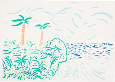
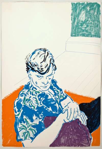
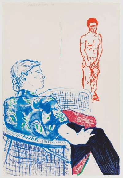
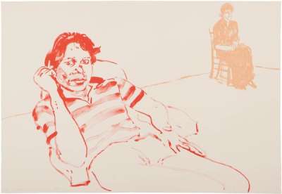
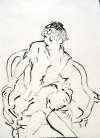
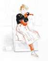
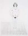
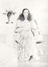
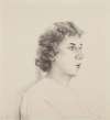
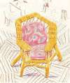
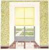
A loose, painterly series of lithographs, David Hockney’s Tyler Graphics 1979 Portfolio show him looking towards Fauvism, inspiring his colour palette and blended approach of block colour, pattern and inky linework.
David Hockney Tyler Graphics 1979 Portfolio For sale
Tyler Graphics 1979 Portfolio Value (5 Years)
With £57282 in the past 12 months, David Hockney's Tyler Graphics 1979 Portfolio series is one of the most actively traded in the market. Prices have varied significantly – from £546 to £33219 – driven by fluctuations in factors like condition, provenance, and market timing. Over the past 12 months, the average selling price was £19094, with an average annual growth rate of 11.62% across the series.
Tyler Graphics 1979 Portfolio Market value
Auction Results
| Artwork | Auction Date | Auction House | Return to Seller | Hammer Price | Buyer Paid |
|---|---|---|---|---|---|
 Bora Bora David Hockney Signed Print | 24 Oct 2025 | Christie's New York | £12,750 | £15,000 | £21,000 |
 Joe With David Harte David Hockney Signed Print | 16 Nov 2024 | Nosbüsch & Stucke | £6,375 | £7,500 | £9,500 |
 Johnny And Lindsay David Hockney Signed Print | 19 Sept 2024 | Phillips London | £2,975 | £3,500 | £4,850 |
 Joe With Green Window David Hockney Signed Print | 20 Jul 2024 | Mainichi Auction, Osaka | £5,525 | £6,500 | £7,500 |
Sell Your Art
with Us
with Us
Join Our Network of Collectors. Buy, Sell and Track Demand
Meaning & Analysis
A loose, painterly series of Lithographs, Hockney’s Tyler Graphics 1979 Portfolio show him looking towards an almost-fauvist style After almost two decades of experimenting with various techniques he had found ways to bring his unique style and aesthetic into the medium of print and the Tyler Graphics 1979 Portfolio sees him pushing this further with a series of lithographs that evoke his painterly – almost Fauvist – style. Here we see him return to the subject of his friends, which he had explored in a 1976 portfolio, using them as models for portraits that are characterised by their intimacy and tenderness. Recurring characters such as Henry Geldzahler, Ann Upton and Joe Macdonald feature prominently along with other figures such as David Harte and a young boy named Byron.
The prints are characterised by their loose, inky style that suggests a great freedom of expression. They seem to reference both Matisse, with the strong presence of red and blue, and Toulouse Lautrec, who was an early pioneer of using lithography to create a paint-like effect. Most of the figures are shown lounging in chairs and, as with any other of his series of portraits, here the interiors, though sparse, are almost as important as the subject, creating an anchor that holds the composition together and allows Hockney to demonstrate his talent for perspective and texture.
Lithography was not a natural fit for Hockney at first; he initially preferred etching as it allowed him to work alone, resulting in quicker production times and arguably more spontaneous images, without the help of a master printer. However he soon warmed to the medium when he tried it in the mid-70s and adopted the method of drawing with a brush dipped in tusche (diluted lithographic ink) which allowed him to work more freely. Speaking in 1980 about his unfailing enthusiasm for learning new techniques, the artist stated, “I love new mediums … I think mediums can turn you on, they can excite you: they always let you do something in a different way”.
