

Drawings
Drawing was a crucial first step to Lichtenstein’s paintings. It was here that the artist decided how to crop his comic book references and if he wanted to make changes to the original source. For his famous painting Drowning Girl – taken from the story Run for Love! in DC Comics Secret Love #83 in 1962 – Lichtenstein focussed in on the girl and changed her thought bubble text from “I don’t care if I have a cramp! I’d rather sink — than call Mal for help!” to the shorter, more dramatic “I don’t care! I’d rather sink — than call Brad for help!” Lichtenstein then enlarged his drawing onto a pre-primed canvas using a projector and traced over the lines in pencil, before filling in the forms using paint.
Despite working from a drawing, Lichtenstein found he could still be surprised by the final result. In an interview with musician David Bowie, Lichtenstein admitted: “A lot of things are worked out in the drawing. But even then, I still allow for and want to make changes”.

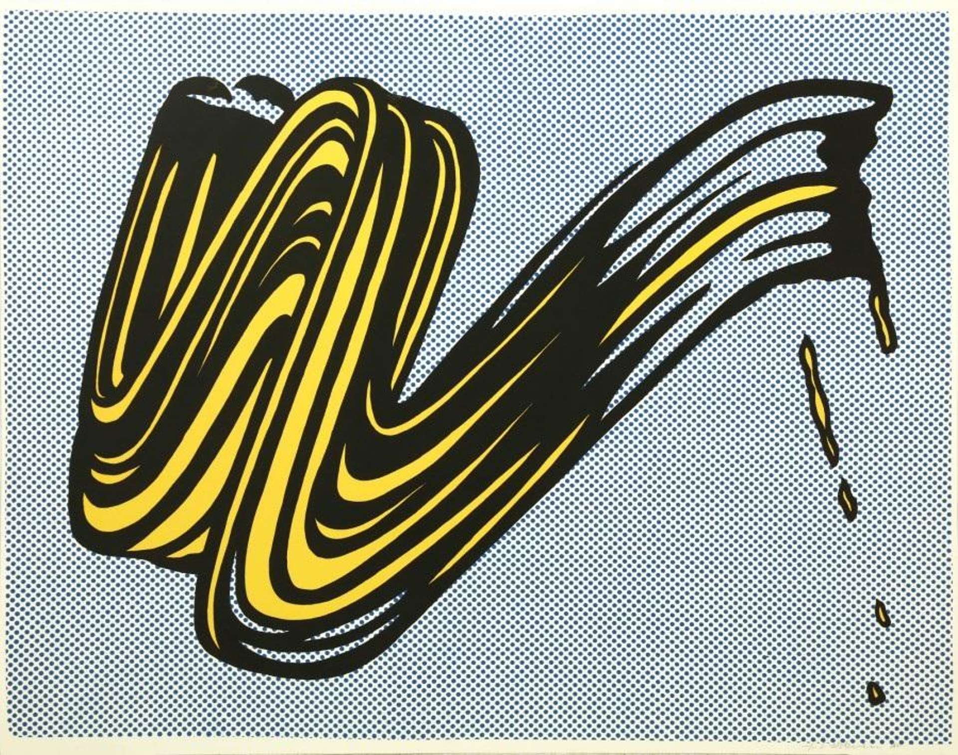
Dot Paintings
Lichtenstein’s paintings may look machine-made, but each dot is carefully and painstakingly painted by hand. For his painting Whaam!, Lichtenstein created his signature Benday dots using an aluminium mesh as a template, pushing oil paint through the holes using a toothbrush. Benday dots (also called Ben-Day or Ben Day dots) are named after the 19th-century illustrator and printer Benjamin Henry Day, who introduced the use of small, coloured dots in industrial printing to create gradual shading and block colours. Lichtenstein would use both techniques in his paintings – at the start of his Pop Art career, he covered large areas of his canvas in dots of the same size and colour; in his later Nudes series, he used dots of varying sizes to create changing shades of light and dark.
Lichtenstein then outlined his pencil marks in thick black lines and used Magna paint – a fast-drawing acrylic paint popular at the time – to fill in the large areas of red and yellow. Although Lichtenstein wanted his paintings to look as industrial as possible, on close inspection it is still possible to see the texture of his brushes, movement in his hand-painted lines and his original pencil marks.

Typography
Before the 1960s, text was associated with commercial design, not art. Lichtenstein and his contemporaries, like Ed Ruscha, began to blur the lines between typography and fine art.
Lichtenstein’s use of text is as iconic as his comic book characters. Beginning with his first Pop Art painting, Look Mickey, text became a prominent feature of his early cartoon-inspired artworks on romance and war. He played with words to create dramatic events (“Whaam!”), provide context for the painting (“I Can See the Whole Room…and There’s Nobody in It!”) or to give the story more mystery (“Oh, Jeff… I love you, too… but…”). By the 1970s, Lichtenstein had stopped using text for his later series, such as the Brushstrokes, Landscapes and tributes to art historical masterpieces.

Sculptures
Lichtenstein created sculpture pieces throughout his career, turning his most popular subjects into three-dimensional form using painted aluminium or painted bronze. He has made sculptural versions of his Abstract Expressionist brushstrokes, nudes and everyday objects, like a glass of water or a coffee cup. Much like his paintings and prints, Lichtenstein’s sculptures blur the boundaries between high art technique and supposedly low art subjects.

Prints
During the 1960s, many Pop artists turned to commercial printing techniques for their artworks, interested in blurring the lines between fine art and mass production (the most famous example was, of course, Andy Warhol). Lichtenstein made his first Pop Art print in the mid-1960s. He would go on to produce over 350 print editions in a variety of techniques – including screen printing, lithography, woodcuts or a combination of two.
Some of Lichtenstein’s prints reproduce his most popular paintings. Other works only exist as print editions – for example, his jazz-inspired Reverie from 1965, or his tribute to Monet’s Haystacks from 1969. As usual for the print market, Lichtenstein’s prints with a low edition number are rarer and more valuable. Woodblocks from his Pop Art period are especially desirable, however, while prints with mid-to-high edition numbers are popular choices for short-term investments.