This Is Where Its Fuckin At
This Is Where Its Fuckin At, At Least It Used To Be is one of Miller’s earliest forays into imaginary fiction, and is a prime example of both his dry wit and knack for subverting hackneyed phrases, and his reinterpretations of the classic orange dust jackets now engrained in our collective unconscious by Penguin books. Miller later re-worked this piece, especially for the Penguin head offices and debuted at the White Cube, adding an apostrophe, as well as a couple of stars. In 2012 Miller released a grey silkscreen print edition — an edition of 50 — each signed and numbered by the artist. To date this is Miller’s most popular print.
Miller created a painting, This Is Where Its Fucking At, as early as 2002, before later making the more colloquial version without the 'g'. An original painting before the rework sold for an astonishing £234,175 at a recent 2022 Sotheby's New York auction.

Don’t Let The Bastards Cheer You Up
Oozing his usual mischief, this artwork of Miller’s is a play on the old adage ‘Don’t Let The Bastards Get You Down’ (most recently featured as a Latin inscription in the televised version of Margaret Atwood’s The Handmaid’s Tale).
This run of silkscreen prints (an edition of 50, all hand signed and numbered by the artist) originates from a watercolour Miller produced for his exhibition of the same name at The Baltic, Gateshead in 2009. The exhibition also featured other sarcastic re-workings of popular book titles specific to the North East of England (where Miller was born and raised), such as Gateshead Revisited, Evelyn Waugh.

I Am The One I Have Been Waiting For
In response to the commercialisation of Valentine’s Day, where we are made to feel incomplete without the validation of another, Miller created this artwork – an anti-Valentine’s day card, and the ultimate treat for yourself! I Am The One I Have Been Waiting For was first released in pink dust jackets in 2011 as an edition of 15 signed and numbered prints from the Reflex Gallery in Amsterdam.
It was then released as a ‘Penguin Plays’ edition of 50; and finally, in 2016 it was released as an edition of 50 yellow dust jackets that Miller featured in an exhibition of his work at the Blain|Southern Gallery.

Love Saves The Day
Love Saves The Day was also the title of Miller’s exhibition at the Prisunic Gallery in 1991 in New York and is proof Miller has an optimistic, even sentimental side, that is as equally popular as his more sardonic one.
In 2012 Miller created a marbled version of the Penguin dust jackets, rendered in watercolour and pencil, it was featured in his solo exhibition at the Reflex Gallery, Amsterdam. Pink dust jacket versions were released in 2014 in an edition of 100, and then again as a limited edition of 50 published by the white Cube. All of Miller’s prints are hand signed and numbered by the artist.

You Can Rely On Me
Subtitled I’ll always let you down; You Can Rely On Me is the perfect example of Miller’s ability to subvert a cliché and infuse it with his dry humour. This print of a red Penguin dust jacket was first released in 2011 as an edition of 15 published by Reflex Gallery Amsterdam. Five artist proofs of the red version, each hand signed and numbered prints, were also released.
It was also released in 2011 as a grey dust jacket in a limited edition of 35; and Miller ultimately created an orange version of the work to hang in Harland Miller: Overcoming Optimism, November 2012 – January 2013, at the Ingleby Gallery, Scotland.

Love, A Decisive Blow Against If
In 2012, this 16-colour screen-print, hand signed and numbered by the artist, was released by Miller in conjunction with his aforementioned solo exhibition at the Ingleby Gallery. It was originally released as a maroon dust jacket with two ‘Penguin penguins’, holding hands below the title motif.
Love, A Decisive Blow Against If was released in an edition of 50, and is typical of Miller’s desire to combat the notion that humour and nostalgia are lower forms of art. As he says, “people don’t like to trust their emotions when they look at art I think they prefer to have a cerebral response to work rather than an emotional one because emotion’s not trustworthy … so we have to be careful, wary of them.
They might take us the wrong way.” As one of his most popular prints, consistently in demand, it goes to show that maybe people are starting to trust their emotions in regards to art, certainly in regards to Miller’s art.
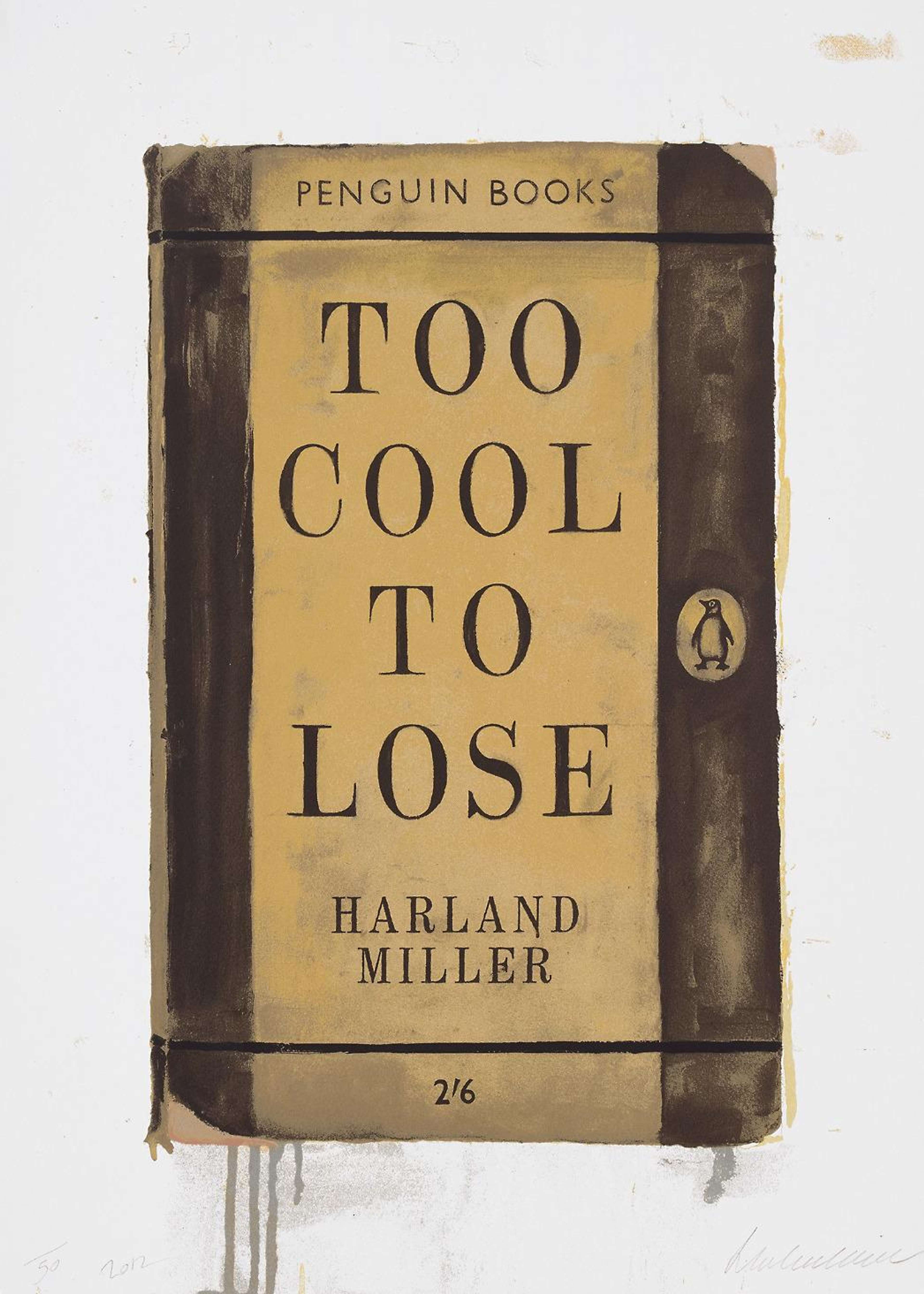
Too Cool To Lose
In this 2012 edition of 50 hand signed and numbered prints published by the White Cube, Miller gets competitive with his humour: rendered in black and the victor’s colour of gold, Miller is insinuating the ultimate irrelevance and absurdity of both competition and popularity – a tongue in cheek work, he is also suggesting that he is ‘too cool to lose’.
Having been everything from a David Bowie impersonator and catwalk model to friend of Jarvis Cocker and a sell-out artist, he may be jeering himself a little with this piece of Contemporary Art, but he also seems to be correct.

International Lonely Guy
The self-mocking title of this print harks back to Miller’s more peripatetic days when the Yorkshire-born artist and writer lived everywhere from New York, to New Orleans, to Berlin during the ‘80s and ‘90s.
As with many of his prints this was released in several editions, the first in 2004, in a muted navy blue with the subtitle Mon Histoire.
In 2010 Miller released an edition of 20 in fuchsia, which was subtitled Harland Miller, the painting of this version was rendered in watercolour and pencil and featured in his exhibition at The Reflex Gallery.
A further edition was released in 2012 as a limited edition of 3, signed and numbered by the artist. In his exhibition at the Ingleby Gallery, though still predominantly in fuschia, Miller took a step away from the more tradition Penguin dust jackets, taking inspiration from the covers of popular psychology books of the ‘60s and ‘70s, with a more graphic print.
International Lonely Guy is also the title of a book Miller released with Rizzoli 2007. The book features an introduction by one of the most respected men in Contemporary Art, and one with a paralleled love of typography, Ed Ruscha.
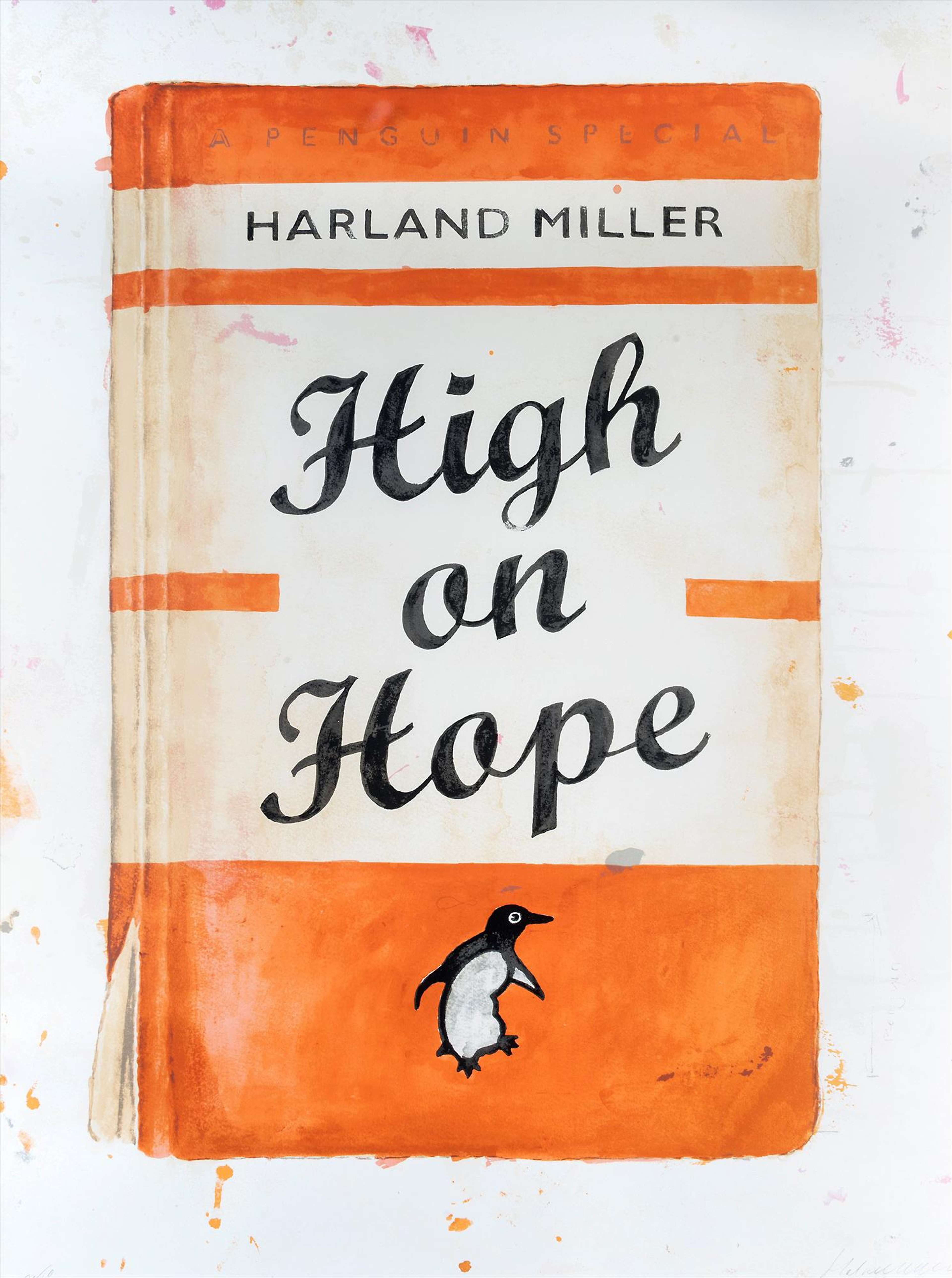
High On Hope
Miller has reinterpreted High on Hope twice. The most popular version was released as a hand finished orange Penguin dust jacket in 2014, an edition of 50 released by the White Cube. The title — Harland Miller, High on Hope – appears to be being lifted, almost floating away; insinuating hope has a drug-like effect on the artist – that there is sometimes a delusional aspect of optimism. Contrarily it could be argued that Miller is saying that we don’t need any intoxicants other than a sunny outlook and our own endorphins.
For the exhibition The Next Life’s On Me at the White Cube in 2012, the more morbid original of High on Hope was an oil on canvas in grey, black and white, with a momento mori between Harland’s initials.
In 2016 Miller recreated the canvas to featured in an auction for the Rainforest Fund.
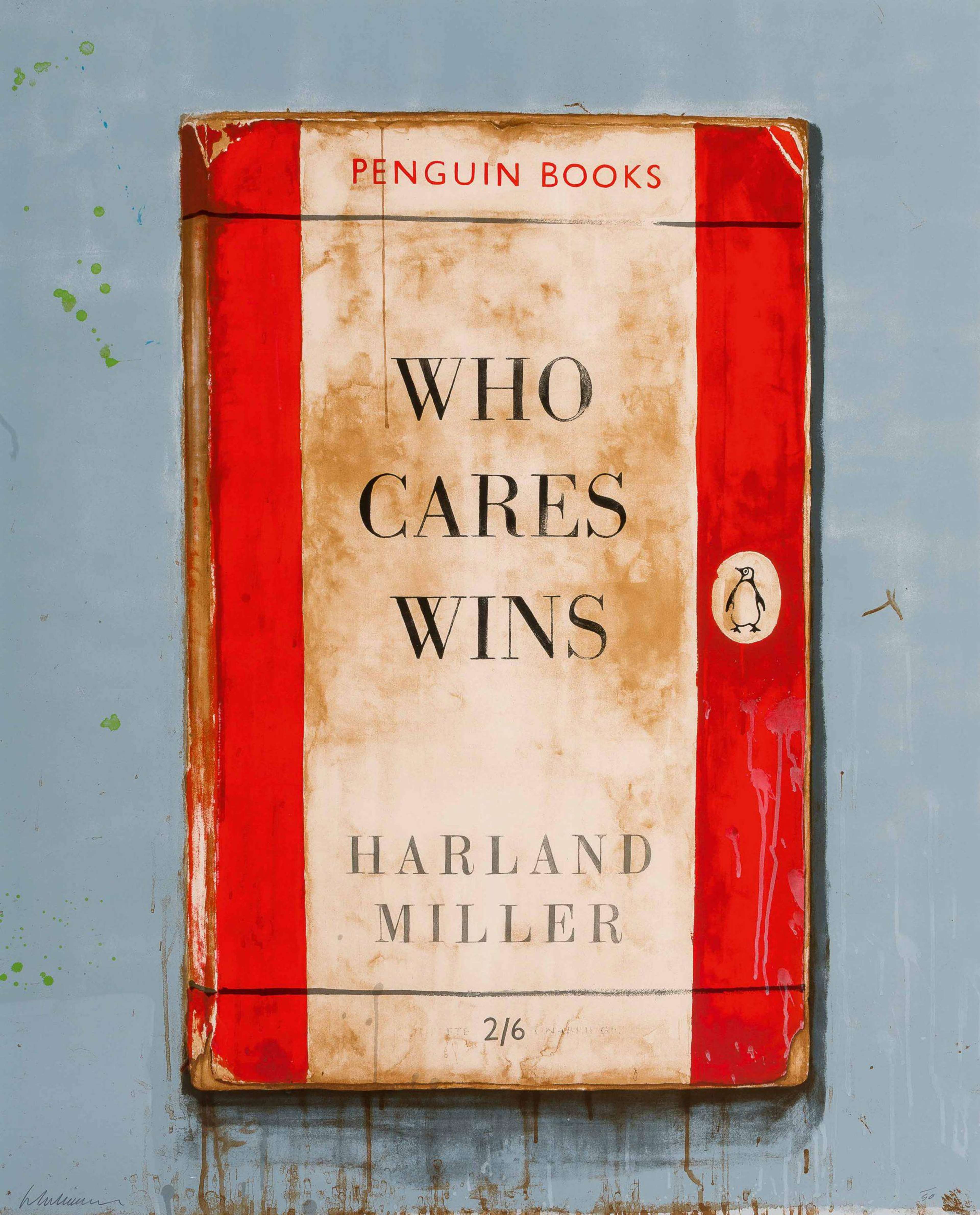
Who Cares Wins
Who Cares Wins is a beautiful, predominantly red, example of Miller’s rendition of a tattered old Penguin dust jacket, and was released by Reflex Gallery in 2014 in two sizes (64 x 50 cm and 138 x 110 cm). Both sizes were in editions of 50, and hand signed and numbered by Miller.
Miller explains this piece to amsterdamart.com, “We all have these personal maxims that make us wince a bit when we don’t live up to them – at least I do.
This title works on that level very well, and it can be directed outwardly as a reminder or rebuke or it can be a personal statement, or it could be ‘Who cares…. wins’ you know like ‘who cares’ as in ‘who gives a damn’ and that self serving attitude makes you a winner – lets hope its not that, but that’s one possible construction you could put upon it…
I made this work at the time when my dad was dying… when you hear it – as its obviously a play on the well known saying WHO DARES WINS you hear that too – subconsciously you hear that and your processing the two things together – I wouldn’t say they were exact opposites but WHO DARES has a boastful kind of bravado about it which ‘caring’ doesn’t, I think it imports a little of that dashing romance into the realm of sensitivity… I don’t have many titles like that.”
In 2016 Miller joined a number of Contemporary Artists including David Birkin and Jake and Dinos Chapman as part of the auction Artists with Liberty: Save Our Human Rights Act in aid of protecting our Human Rights Act. This particular edition — Who Cares Wins (Liberty) — was released in Pink in an edition of 25 for the cause.