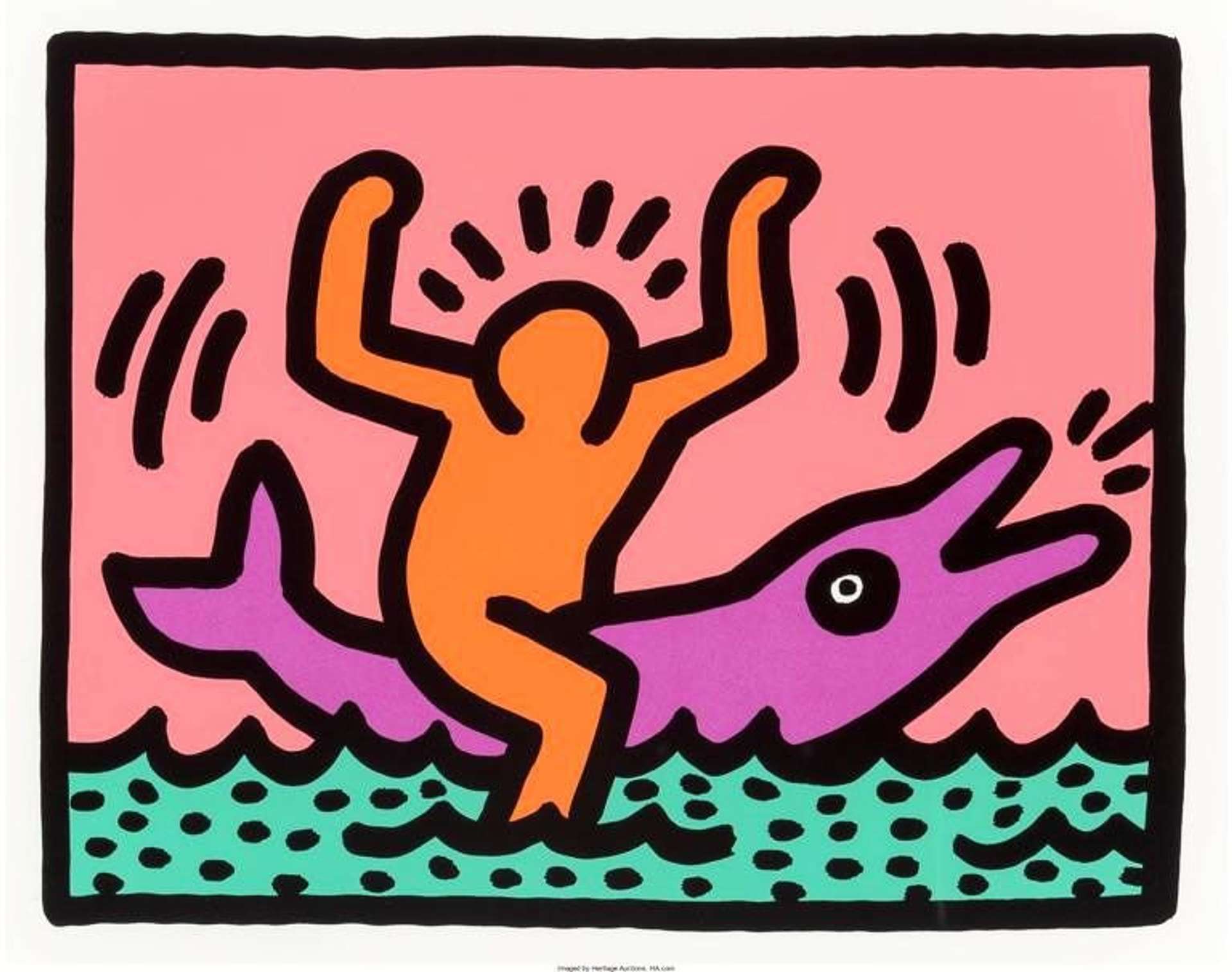
The Emergence of Keith Haring: A Symbol of the New York City Art Scene
Haring's journey into the art world began in a small town in Pennsylvania, far from the gritty streets of New York City where he would later make his mark. Born in 1958, Haring was drawn to art from a young age, influenced by the cartoon culture of his time. Haring’s early life was marked by a healthy appetite for drawing, a skill he honed through his childhood and teenage years.
In 1978, Haring moved to New York City, immersing himself in the thriving alternative art community. It was here, amidst the vibrant street culture, that he found his true calling. Haring quickly became a fixture on the New York City art scene, his work notable for its distinctive, bold lines and animated figures. The 1980s saw Haring's rise to prominence, as he transitioned from subway drawings to gallery exhibitions, becoming an icon of urban art and a voice for social activism.

Minimalism and Symbolism: A Study of White Icons and Stones
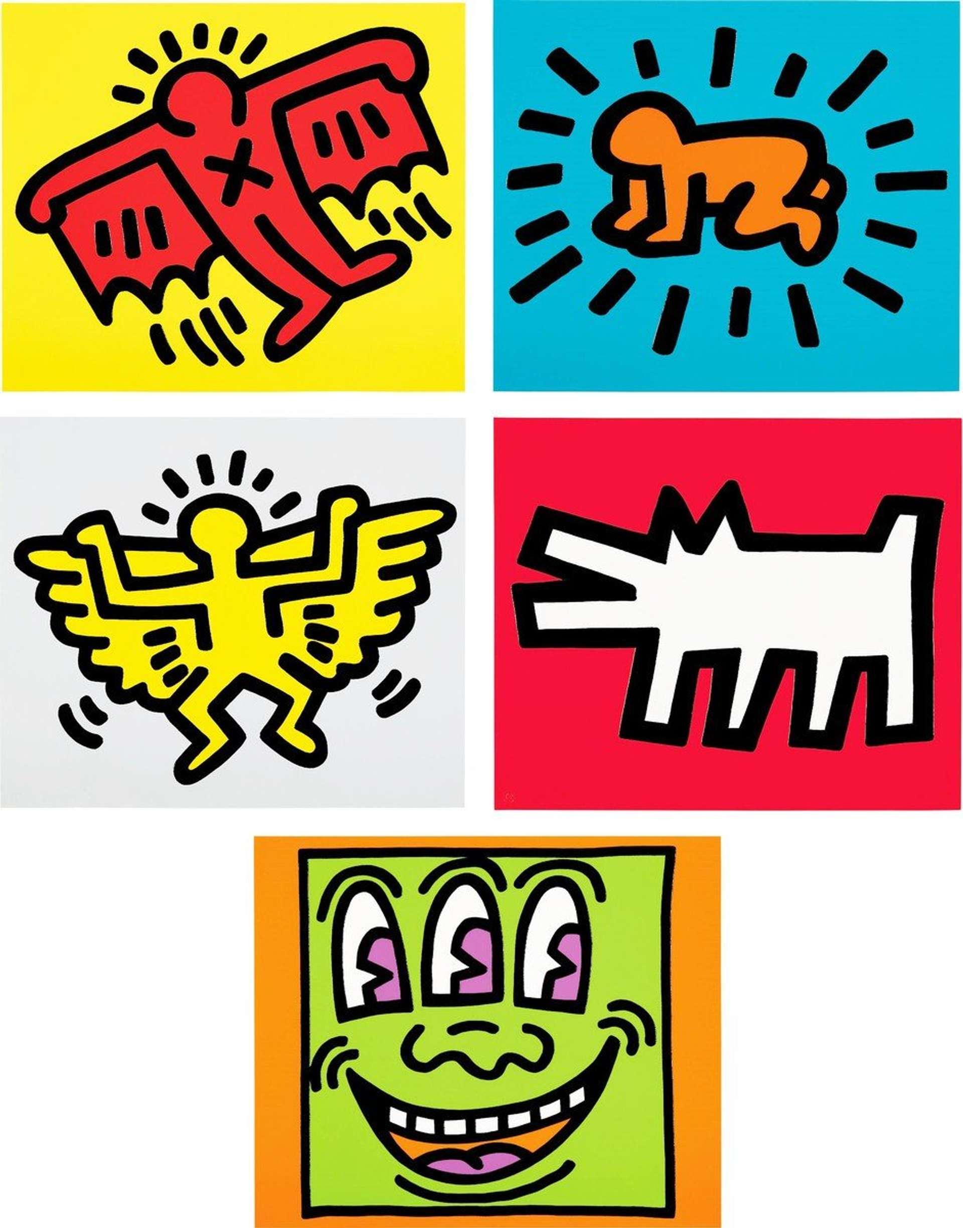
Haring’s artistic exploration often ventured into minimalism, a concept most prominently showcased in his White Icons and Stones series. In White Icons, Haring renders his iconic symbols as embossed images on plain white paper. This presentation strips the artwork of its otherwise electric colour palette, focusing instead on form and shape. The series features familiar motifs like the radiant baby and barking dog, all integral elements of Haring's visual language. These embossed icons, devoid of colour, still manage to evoke a powerful and universal message, resonating with viewers on a fundamental, almost primal level.

Created towards the end of Haring’s life, the lithographs in Stones are notable for their intricate designs that maintain a simplicity of lines. The stark black and white imagery recalls Haring's early subway drawings, the very genesis of his public art persona. These works, drawing inspiration from a multitude of cultural and historical art forms, from Aboriginal to Renaissance art, showcase Haring’s ability to synthesise these influences into a cohesive, impactful style. The Stones series not only highlights Haring's return to lithography but also depicts his mastery over this medium. The bold lines, reminiscent of his more colourful works, retain their dynamism even in black and white, proving that Haring's talent isn’t reliant upon colour.
In both series, Haring demonstrates an exceptional skill in conveying energy and movement through minimalistic techniques.

The Energetic Palette of Apocalypse: A Contrast in Style
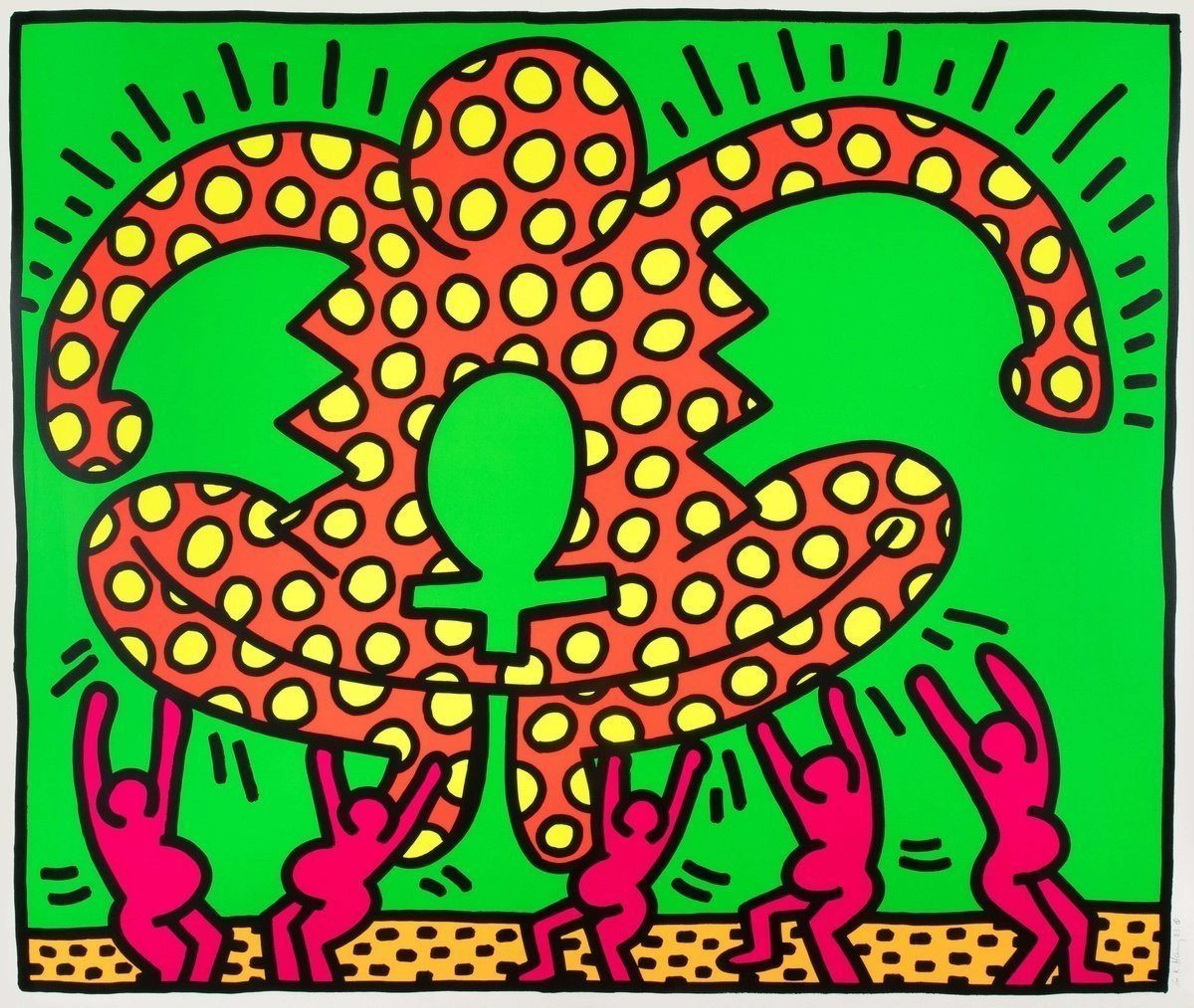
Haring's Apocalypse shifts from his usual style, embracing bold and primary colours to reflect themes of war, destruction, and surreal visions. This series, a collaboration with Beat Era poet William S. Burroughs, blends Haring's signature graffiti-inspired drawings with found images, creating a one-of-a-kind visual narrative. The use of primary colours in Apocalypse not only adds a layer of visual intensity but also creates a jarring contrast with the series' dark themes. These colours amplify the impact of the imagery, making the scenes of chaos and dystopia even more vivid and unsettling.
In Apocalypse, Haring's colours, typically used to animate his characters and backgrounds, take on a more subtle role. Although his usual palette is present, the colours in this instance act more as supporting elements. Burroughs' influence is evident in the disjointed, cut-up style of the series, mirroring the fragmented nature of Haring's visual storytelling. The bright colours within the series’ grim content creates a powerful dichotomy, highlighting the anxiety of the era, particularly in the context of Haring's own life challenges.

Vibrancy and Pop Culture: The Andy Mouse Series
Haring's Andy Mouse series is a vibrant celebration of pop culture, where the artist's playful imagination meets the colourful world of commercialism. In this series, Haring merges the iconic imagery of Mickey Mouse with the persona of his friend and mentor, Andy Warhol, creating a whimsical fusion that is both a tribute and a commentary.
The bright blues, electric greens, and expressive reds not only draw the viewer's eye but also showcases the series' playful nature. Haring's use of colour also speaks to his blend of commercialism and fine art. By adopting the commercially popular image of Mickey Mouse and infusing it with the art world's avant-garde style, Haring blurs the lines between high art and popular culture.

Championing LGBTQ+ Rights: The Pyramids Series
Haring's Pyramids visually proclaim his unwavering support for LGBTQ+ rights. In this collection, Haring skillfully incorporates symbols that celebrate sexual diversity and freedom. The pyramid, a recurring element, becomes a powerful metaphor for the strength and unity within the LGBTQ+ community. Bold lines and moving figures intertwine, creating a visual narrative that reflects Haring's commitment to breaking societal barriers and advocating for equal rights. Through this series, Haring not only expresses his personal identity but also contributes to the broader conversation on LGBTQ+ visibility in the art world.

The Fight Against Racial Injustice: Apartheid and the Free South Africa Series
In his Free South Africa suite, Haring took a bold stance against apartheid, using his art as a tool for political expression and social change. The series features a collection of works where Haring employs his signature style of vivid, dynamic figures and stark symbols to critique the oppressive racial segregation system in South Africa. These pieces are characterised by their directness and powerful imagery, effectively conveying a message of solidarity with the anti-apartheid movement.
Haring's ability to communicate complex social issues through simple yet significant imagery is evident in this series. He transforms his iconic characters and symbols into messengers of equality and justice, making a strong political statement against racial discrimination. Free South Africa not only reflects Haring's commitment to racial equality but also exemplifies his broader engagement with social and political issues through his art, cementing his legacy as an artist who fearlessly used his talent to challenge injustices.

Democratising Art: The Pop Shop Series and 'Art is for Everyone' Ethos
Haring's establishment of the Pop Shop in 1986 was a bold stride towards making art universally accessible. This initiative, rooted in Haring's conviction that art should transcend gallery spaces, enabled a broader public engagement with his work. By offering prints, merchandise, and clothing featuring his iconic designs at affordable prices, Haring challenged the conventional confines of the art market. The Pop Shop Series epitomises his dedication to dismantling the elitist boundaries within the art world, playing a key role in the democratisation of art.
Art as a Voice for Social Change: Haring's Engagement with Societal Issues
Haring believed in the power of art to provoke thought and inspire change. His work often tackled critical social and political issues, from AIDS awareness to apartheid. Haring used his art as a medium to voice concerns, raise awareness, and engage the public in dialogue about pressing societal matters.
His work was not just visually striking but also rich in content and meaning. Through bold lines and vibrant colours, Haring addressed themes such as inequality, violence, and oppression. He did not shy away from controversial topics, instead using his art to bring them to the forefront of public consciousness. Haring's engagement with societal issues was a critical aspect of his work, reflecting his commitment to using art as a tool for social change. His legacy continues to inspire artists and activists, proving that art can be a powerful catalyst for societal transformation.
In both public art and social engagement, Haring's work remains a benchmark for how art can transcend the confines of galleries and museums to become a vital part of the social fabric. His contributions continue to influence contemporary discussions on the role of art in society.
Recent Campaigns & Ongoing Activism
The ongoing use of Haring’s visual language shows how his iconography remains a powerful vehicle for advancing LGBTQ+ visibility and HIV/AIDS advocacy. Jean Paul Gaultier’s Classique and Le Male Pride 2024 editions restage Haring’s black-and-white line work on the brand’s perfume bottles, translating his joyful, body-positive figures into packaging that reads clearly on shelves and across social media. The choice is intentional: Haring’s dancing bodies and interlocking lines signal community, pleasure and solidarity - values central to Pride. The house frames the design as an homage to Stonewall’s legacy, extending the collaboration into limited-edition tins, in-store displays and Pride-season content that bring Haring’s inclusive iconography to a mainstream audience.
Furthermore, beneath the brand activity sits The Keith Haring Foundation’s pragmatic model of cultural philanthropy. Established to steward Haring’s estate, it licenses the artist’s imagery and channels partnership income into grants. Its priorities mirror Haring’s late-1980s activism: AIDS/HIV education, prevention and care, and access to the arts for children and young people. This structure turns recognition into resources - keeping the work present in culture while supporting organisations delivering testing, treatment access, youth outreach and arts education. The Foundation ensures every new appearance of Haring’s figures does double duty: celebrating a visual language of unity while funding the communities it was made to serve.