White
Icons
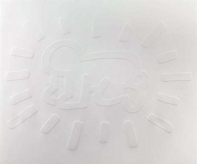
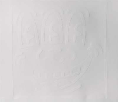
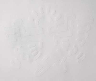
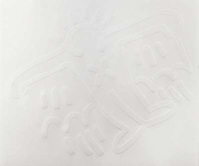
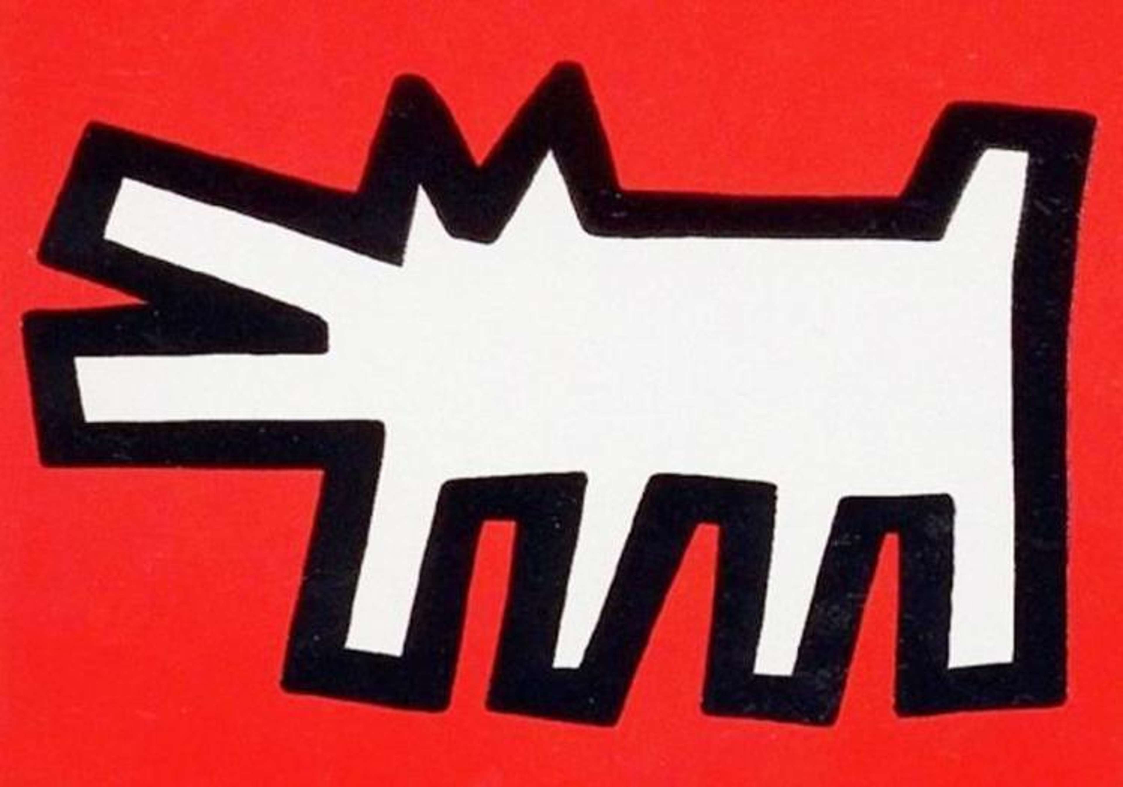
In his 1990 White Icons suite, Keith Haring reproduces his Icons print series exactly, only without colour; here, each symbol is presented purely, as an embossing on white. He highlights his best-known icons—the radiant baby, angel, flying devil and barking dog—acknowledging the fame these symbols had attained.
Keith Haring White Icons For sale
White Icons Value (5 Years)
The White Icons series by Keith Haring features both signed and unsigned editions, which diverge significantly in value. Signed examples consistently command premiums, with hammer prices reaching up to £22629. Across the series, 24 total auction sales have been recorded, with an average annual growth rate of -1.02%. For collectors, edition type plays a pivotal role in value potential within this series.
White Icons Market value
Auction Results
| Artwork | Auction Date | Auction House | Return to Seller | Hammer Price | Buyer Paid |
|---|---|---|---|---|---|
 Barking Dog (white) Keith Haring Unsigned Print | 4 Dec 2025 | Artcurial | £3,655 | £4,300 | £6,000 |
 Angel (white) Keith Haring Unsigned Print | 12 Nov 2021 | Christie's New York | £11,900 | £14,000 | £19,000 |
 Three Eyed Monster (white) Keith Haring Unsigned Print | 2 Nov 2021 | Bonhams New York | £3,740 | £4,400 | £5,500 |
 Flying Devil (white) Keith Haring Unsigned Print | 26 May 2021 | Bonhams New York | £4,675 | £5,500 | £7,000 |
 Radiant Baby (white) Keith Haring Unsigned Print | 5 Dec 2016 | Forum Auctions London | £2,975 | £3,500 | £4,400 |
Sell Your Art
with Us
with Us
Join Our Network of Collectors. Buy, Sell and Track Demand
Meaning & Analysis
White Icons is a set of five prints from 1990 each showing a single one of Haring’s famous symbols, rendered as an embossing on plain white paper. Exactly mimicking the artist’s Icons series but without colour, these images represent some of Haring’s most recognisable motifs of his career showing the radiant baby, angel, flying devil, three-eyed monster and barking dog.
Much like fellow graffiti artist Jean-Michel Basquiat, Haring reuses particular symbols, all present in the Icons series, to produce a memorable pictorial language. Haring produces a set of recognisable positive symbols and clear-cut narrative views in his use of simplified form and repetition of images from previous works. The symbols used in White Icons first appeared in Haring’s New York subway drawings from the beginning of his career, notably the radiant baby ‘tag’ that the artist used in place of his signature on public art projects. Uncompromising in its positive tone, Haring’s syntax of signs in this series creates a universal language to be seen and understood by the masses of New York, thus producing a true public art charged with meaning.
Rendered in his characteristic pop-graffiti style, these figures are formed from bold embossed contours with thick, rounded lines radiating from the figures to provide a sense of excitement and movement. Whilst Haring’s Icons series is rendered in flat, saturated colours as a nod to the rise of commercialism and mass production in the artist’s lifetime, White Icons has been stripped of the eye-catching colours of the original prints. The way in which Haring has depicted these icons without their original saturated colours works to simplify the images down even further and create a more subtle tone to the works.
