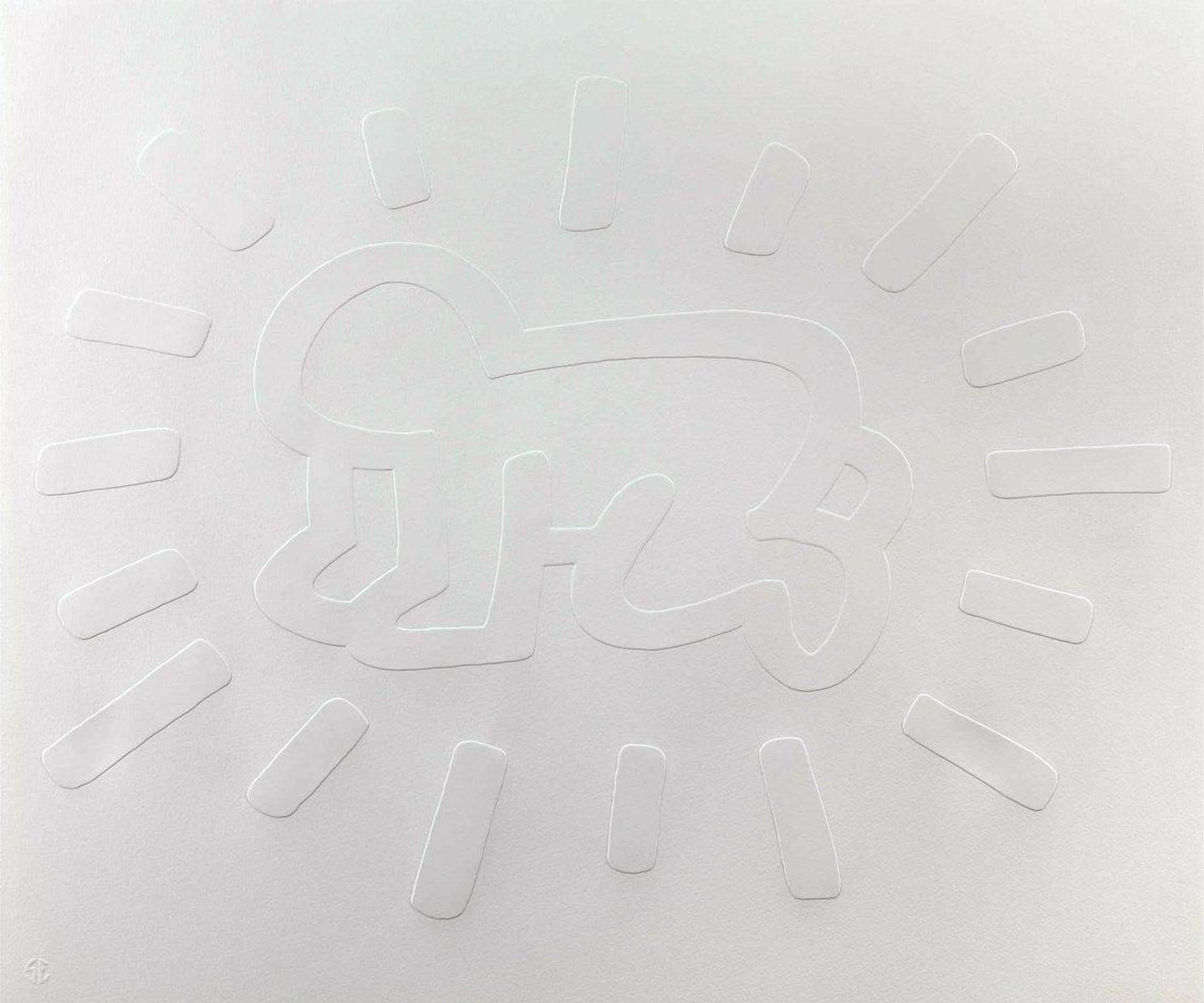
Created in 1990, White Icons combine some of the most powerful symbols associated with Keith Haring’s signature cartoon-like visual language. The series sees the artist taking a step in the direction of a pared-down representation, focusing on the purity of the image.
The series is characterised by minimalism and the use of simplified forms.

Recognizable and immediately arresting, a series of simplified and pure forms comes to the fore in the White Icons series. A deceptively simple visual language reminds us of Haring’s belief that, in order to create dialogue between people and bring them closer together, art needs to be direct and accessible.
The portfolio draws upon Haring’s Icons series.

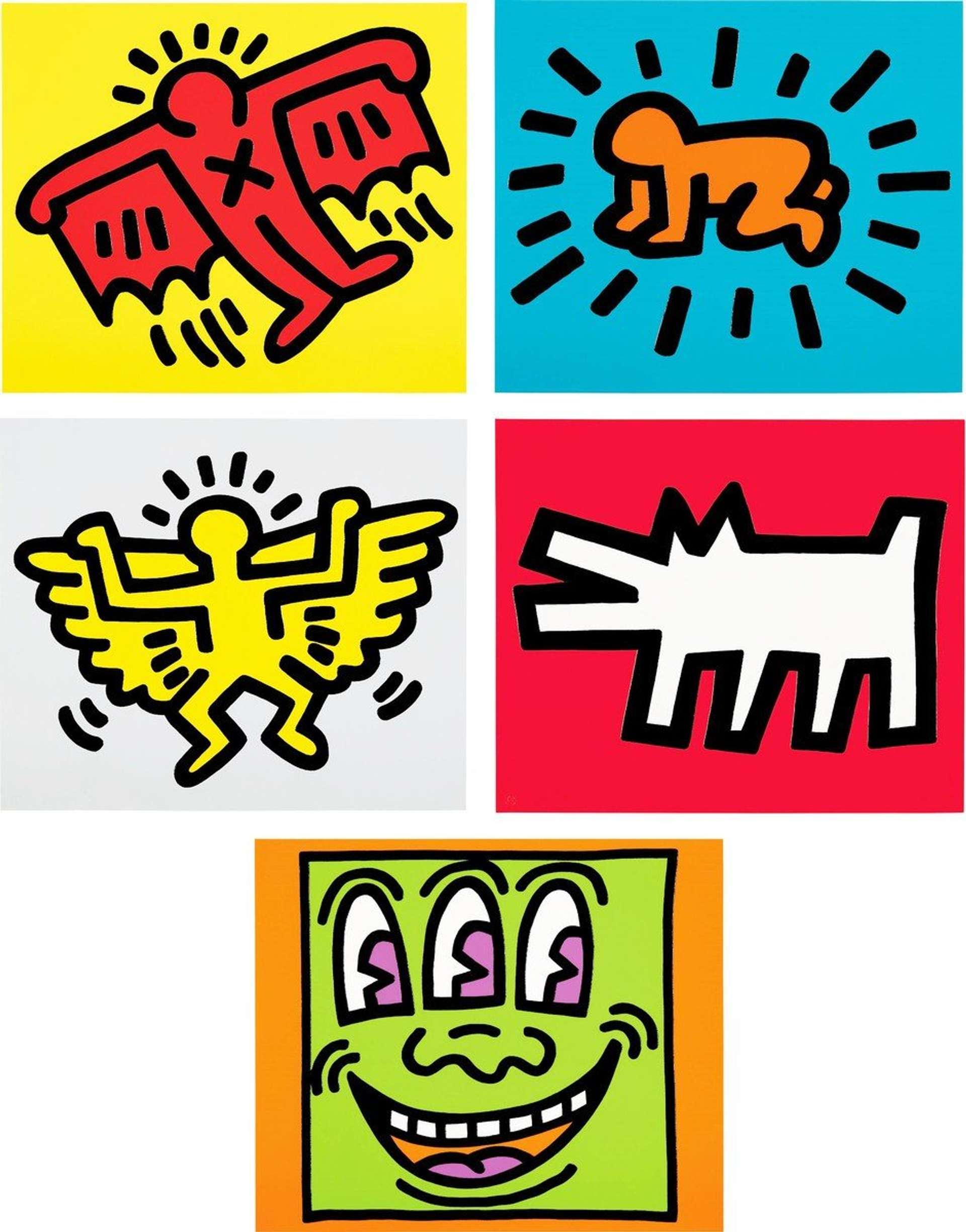
In 1990, Haring released a series of five embossings characterised by the focus on symbolism and the use of bold colours. The White Icons echo the previous series as each print displays only one symbol without employing any colours.
White Icons are rooted in contrasts between light and darkness that surround life and death.

Reappropriating redemptive imagery and rejecting colours, White Icons are suffused with contrast between life and death, light and darkness, religion and sexuality. The purity of the image and powerful symbolism correspond strongly with Haring’s experience of the HIV/AIDS epidemic in the 1980s.
The series features most of Haring’s signature motifs.

The Barking Dog, Radiant Baby, Three Eyed Monster, Flying Devil and Angel represent some of Keith Haring’s most recognisable visual motifs and the artist incorporates all of them to White Icons.
The White Icons reappropriate traditional Christian iconography.

Haring’s encounter with the Jesus Movement left a palpable imprint on the series. In White Icons, Haring takes recourse to the religious source material and reshapes Christian iconography to create a bold visual language that evokes the sociocultural tensions of his time.
The inspiration of Jean-Michel Basquiat is strongly present in the series.
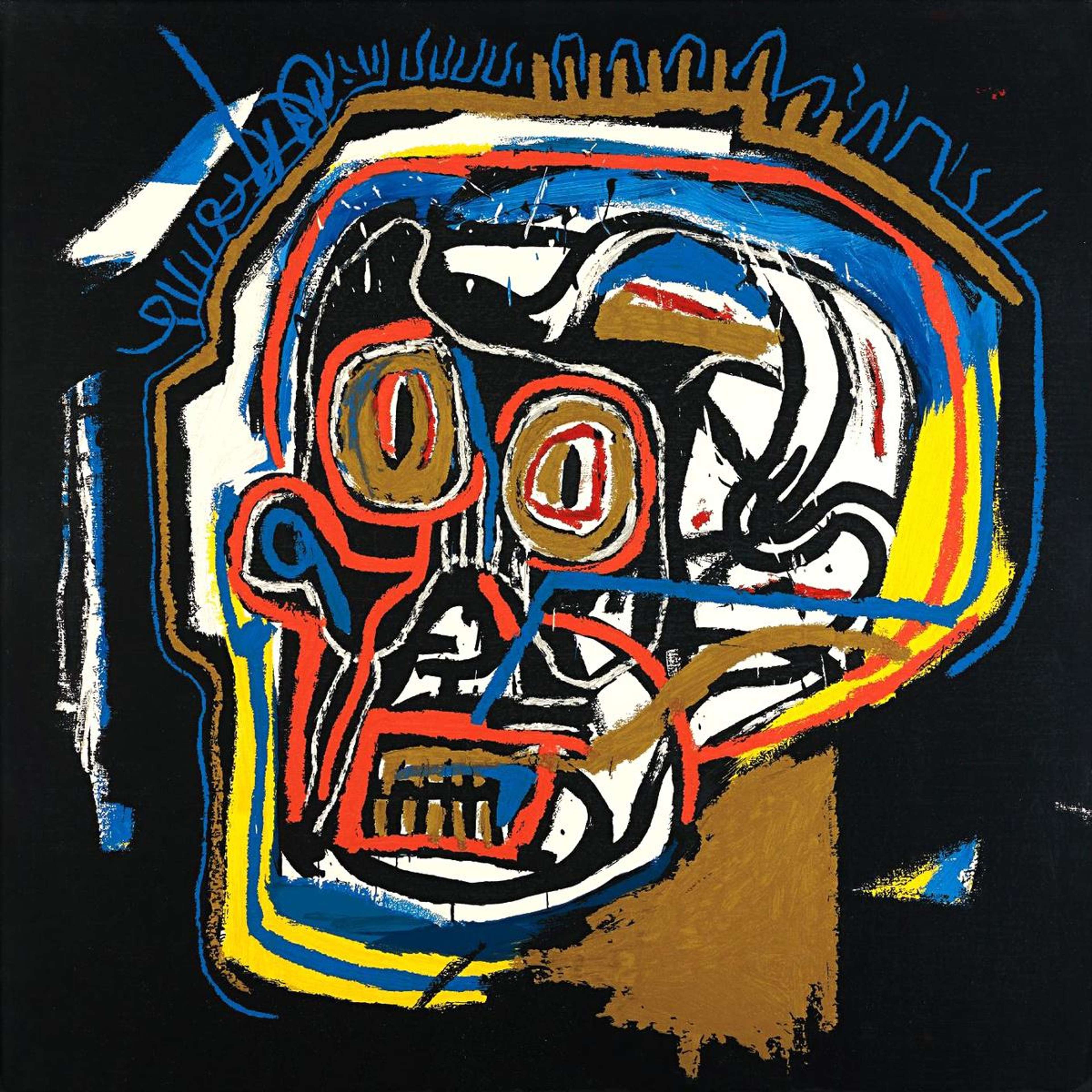
Close friends and prominent figures within Manhattan’s creative circles in the 1980s, Basquiat and Haring created works grounded in simplistic forms and minimalism. White Icons show that the appearance of such forms is often very deceptive. As in the case of Basquiat, after a closer look, iconography in Haring’s works reveals a complex web of references as well as a historical lineage.
The series captures Haring’s recognizable pop-graffiti style.

Evocative of the creative energies of 1980s street culture that inspired Haring across his career, the symbols combined in his White Icons series represent the foundations of Haring’s recognisable Pop-graffiti style. The cartoon-like imagery displayed in the series established Haring as a leading artist of his generation.
The pared-down visual language contrasts with Haring’s most popular series.

White Icons mark a stylistic change in Haring’s practice. The gaudy colours and of the artist’s previous series give way to a uniform brightness and a sense of purity of the image.
The White Icons series highlights Haring’s skill in creating powerful symbols within limited means.
Characterised by simplicity and abandonment of colour, White Icons evoke tensions of the 1980s as well as an array of historical associations even though Haring’s reduction of his visual language reaches its height in the series.
White Icons remind us about Haring’s roots in street art.

The symbols featured in White Icons appeared first in Haring’s subway drawings. Haring’s use of a simplistic, solid line defines both his early subway drawings and this late series.